This website uses Cookies. Click Accept to agree to our website's cookie use as described in our Privacy Policy. Click Preferences to customize your cookie settings.
DQL
Questions about Dynatrace Query Language
Turn on suggestions
Auto-suggest helps you quickly narrow down your search results by suggesting possible matches as you type.
- Community Home
- Platform
- DQL
- How to plot a graph comparing successful API hits today vs. same day last week?
Options
- Subscribe to RSS Feed
- Mark Topic as New
- Mark Topic as Read
- Pin this Topic for Current User
- Printer Friendly Page
How to plot a graph comparing successful API hits today vs. same day last week?
Options
- Mark as New
- Subscribe to RSS Feed
- Permalink
07 Dec 2025 11:20 PM - edited 07 Dec 2025 11:21 PM
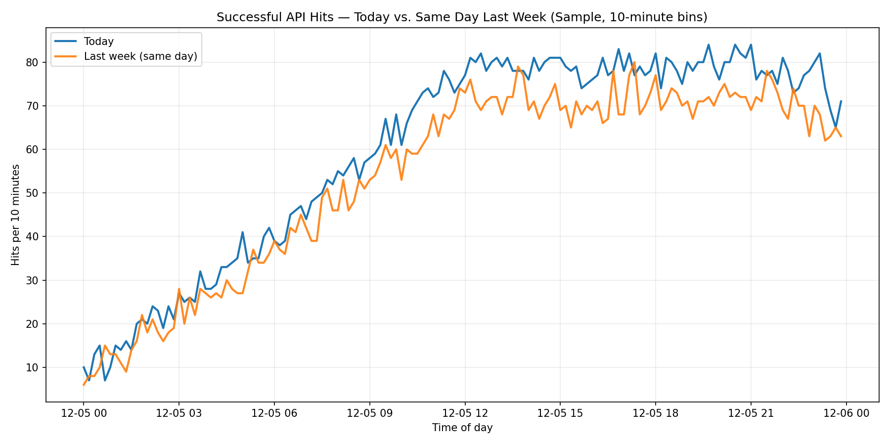
I want to create a time-series chart in Dynatrace that shows the number of successful API hits for today and compares it to the same day last week (aligned by time of day).
I currently have a query that gives me the total count:
fetch user.events, scanLimitGBytes:-1
| filter app.bundle == "com.my.package"
| filter http.response.status == 200
| summarize count()
This works for totals, but I need:
- A graph showing progression throughout the day.
- Two series: Today (Sunday) and Last Sunday(or same weekday last week).
- Ideally aligned so 00:00 today compares to 00:00 last week.
What’s the correct DQL syntax or recommended approach to achieve this? Should I use makeTimeseries or bin()? And how do I shift last week’s timestamps forward for overlay?
A sample image is attached.
Any examples or best practices would be appreciated!
Labels:
- Labels:
-
charts
-
dashboards
-
dql
-
timeseries
2 REPLIES 2
Options
- Mark as New
- Subscribe to RSS Feed
- Permalink
08 Dec 2025 03:27 AM
@subair-appakkan Here is an example for memory, you can use similar logic for your use case
timeseries today = avg(dt.host.memory.usage),
  from:now() - 24h, to:now(),
  by: {dt.entity.host},
  filter: dt.entity.host== "HOST-XXX"

| fieldsAdd lastWeek = lookup ([timeseries mem = avg(dt.host.memory.usage),
  from:now() - 7d - 24h, to:now() - 7d,
  by:{dt.entity.host},
  filter: dt.entity.host == "HOST-XXX"],
  sourceField:dt.entity.host, lookupField:dt.entity.host)[mem]
Phani Devulapalli
Options
- Mark as New
- Subscribe to RSS Feed
- Permalink
08 Dec 2025 08:08 AM
I could not make it in the mobile application context.
Featured Posts
