- Dynatrace Community
- Ask
- Dashboarding
- Average, maximum, percentile response time in the dashboard
- Subscribe to RSS Feed
- Mark Topic as New
- Mark Topic as Read
- Pin this Topic for Current User
- Printer Friendly Page
- Mark as New
- Subscribe to RSS Feed
- Permalink
08 Sep 2021
02:50 PM
- last edited on
31 May 2023
12:58 PM
by
![]() Michal_Gebacki
Michal_Gebacki
Hello Dear Community
I want to chart "average", "maximum"... for all my services (for a specific application).
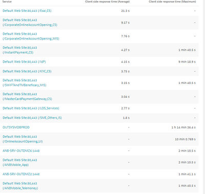
My problem (as shown on the screen below), some services have the "average", but not the "maximum" and vice versa...
Also, the list is not complete, I want the whole services.
Do you have any information about this mistake?
Thanks and have a good day.
Solved! Go to Solution.
- Labels:
-
dashboards classic
-
services classic
- Mark as New
- Subscribe to RSS Feed
- Permalink
08 Sep 2021 08:39 PM
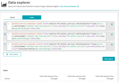
I'm almost sure it's the cardinality limit you have hit. By default the data explorer limits 10 dimensions, see default generated code:
If you have more than 10 services, you need to limit the scope or increase the limit. The issue here is the queries are limited and then joined in a table, so that's why you can see mostly either avg or max values only.
FYI - the limit is 100 per metric selector.
- Mark as New
- Subscribe to RSS Feed
- Permalink
09 Sep 2021 06:24 AM
Thanks a lot @Julius_Loman for your feedback and time.
I explored the code side but didnt take a time to analyse and understand what its writen, i was searching an option but not a code.
Good day man.
- Mark as New
- Subscribe to RSS Feed
- Permalink
09 Sep 2021 06:32 AM
Other thing
I opened a RFE since some weeks
Look at the column names, different aggregations with the same column names.
- Mark as New
- Subscribe to RSS Feed
- Permalink
09 Sep 2021 09:06 AM
passed it to the team, yes I believe it does! Thanks @Julius_Loman for tagging me!
- Mark as New
- Subscribe to RSS Feed
- Permalink
09 Sep 2021 11:42 AM
Hello @zietho
We really need an export option.
This result was asked me to be shown on an excel sheet, I spent a lot of time to make it in the right format.
- Mark as New
- Subscribe to RSS Feed
- Permalink
09 Sep 2021 11:44 AM
we are currently planing for smaller but important additions for q4 and the export known from CC is def. one of the items on the plate and also with a high priority. will let you know when i can comm. a version.
- Mark as New
- Subscribe to RSS Feed
- Permalink
09 Sep 2021 12:43 PM
update: it's a bug and with the ability to rename we also removed this buggy automatic differentiation which we put there in the first place to aid the cases with the same name.
Featured Posts


