- Dynatrace Community
- Ask
- Dashboarding
- Re: Dashboard for Apdex score of Key user action
- Subscribe to RSS Feed
- Mark Topic as New
- Mark Topic as Read
- Pin this Topic for Current User
- Printer Friendly Page
- Mark as New
- Subscribe to RSS Feed
- Permalink
27 Mar 2018
08:07 AM
- last edited on
30 Sep 2022
12:15 PM
by
![]() MaciejNeumann
MaciejNeumann
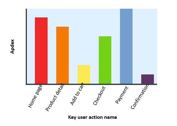
We have a requirement to see the Apdex rating for key user action for one week or 24 hours in the below format. A customer wants to check how the key user actions are behaving over the last 24 hours or one week, just by looking at a single chart.

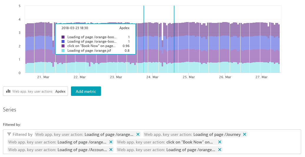
I tried doing this in Dynatrace but it gives the value of all key user actions which are selected at specific intervals. The below image is showing Apdex for the last 7 days with 1-hour granularity.

Can anyone please advise how to achieve this?
Regards
Suresh
Solved! Go to Solution.
- Labels:
-
dashboards classic
-
user actions
- Mark as New
- Subscribe to RSS Feed
- Permalink
27 Mar 2018 09:35 AM
i'm afraid it's not actually possible in current dashboard / custom graphs functionality. you can visualize numbers of key user actions of specific application in appdex levels by "Key user actions" tile
- Mark as New
- Subscribe to RSS Feed
- Permalink
05 Apr 2018
07:45 AM
- last edited on
16 Oct 2023
04:05 PM
by
![]() random_user
random_user
Can you re-post your idea in the product ideas forum? https://community.dynatrace.com/spaces/483/view.html
- Mark as New
- Subscribe to RSS Feed
- Permalink
05 Apr 2018
11:30 AM
- last edited on
16 Oct 2023
04:05 PM
by
![]() random_user
random_user
Hi Alex,
I have already posted this here
https://community.dynatrace.com/spaces/483/dynatrace-product-ideas/idea/199840/rfe-dashboard-for-apd...
- Mark as New
- Subscribe to RSS Feed
- Permalink
31 Jan 2022 07:12 AM
The product idea based on this post "Time-based heatmap - Apdex score by Key user action over time" - has been accepted, but it's not on the roadmap yet.
Current information about the status of this topic you can track in the "Product ideas section",
under the link https://community.dynatrace.com/t5/Dynatrace-product-ideas/Timebased-heatmap-Apdex-score-by-Key-user...
Featured Posts
