- Dynatrace Community
- Ask
- Dashboarding
- Re: Difference between troughput traffic from Service View and Custom Dashboard
- Subscribe to RSS Feed
- Mark Topic as New
- Mark Topic as Read
- Pin this Topic for Current User
- Printer Friendly Page
- Mark as New
- Subscribe to RSS Feed
- Permalink
13 Jan 2020 12:13 PM
Hello community inhabitants,
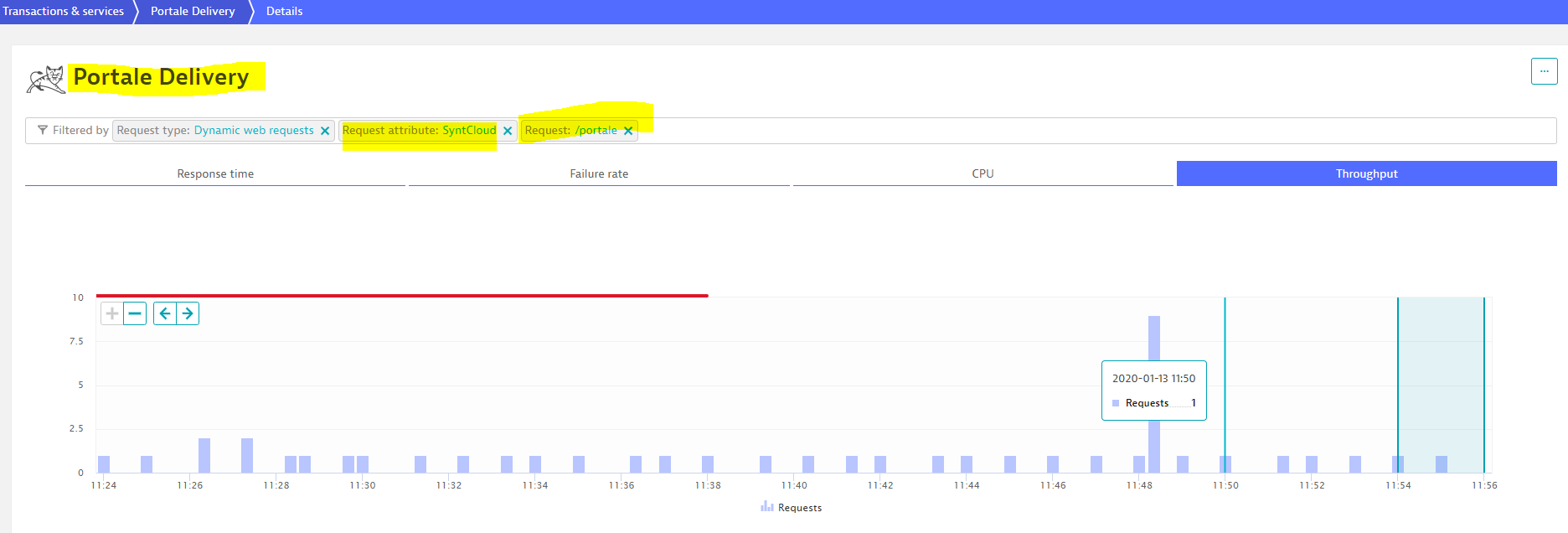
long story short: I tried, via request attribute, to see my synthetic-cloud traffic generated through a third party product on a particular Service, on Dynatrace. And there it was:
The request attribute was captured easly. Every minute one scheduled synthetCloud was executed and the Service View accurately reported the data.
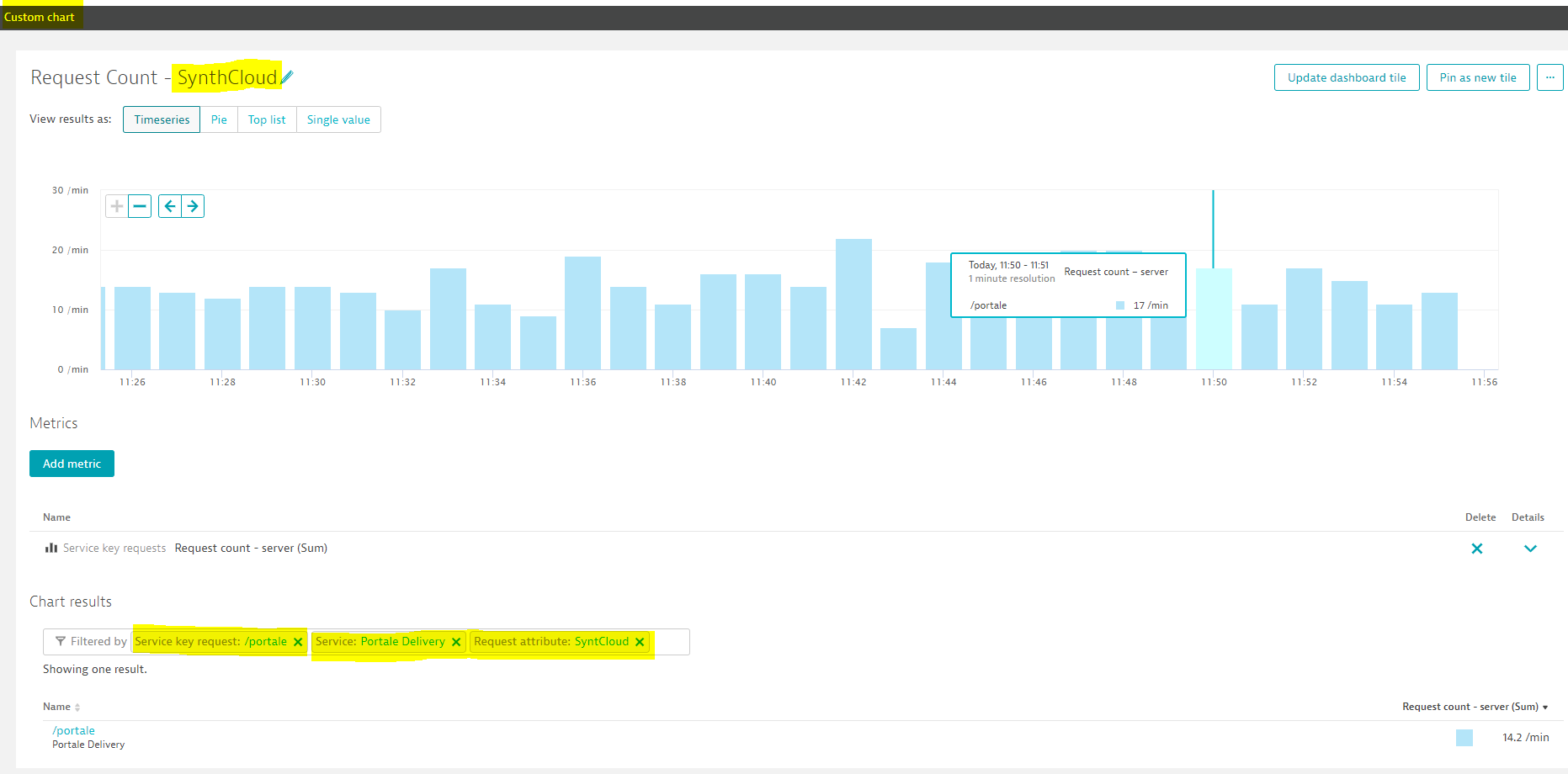
The next step was to put this data on dashboard; I created a custom chart with the same data but the result was now different. I now had more throughtput in the same timeframe and for the same filtering applied:

Since I can't pin to dashboard the exact request with same filter from Service view, how can I represent the data in a custom chart? And why the data is so differtent from Service view to Custom chart?
Have a nice day
Solved! Go to Solution.
- Mark as New
- Subscribe to RSS Feed
- Permalink
14 Jan 2020 09:01 AM
For dynatrace SaaS it’s already available to create custom metrics based on multidimensional analysis views, for managed it should be available soon. Read this post:
This will make exactly what you need.
Sebastian
Featured Posts
