This website uses Cookies. Click Accept to agree to our website's cookie use as described in our Privacy Policy. Click Preferences to customize your cookie settings.
Dashboarding
Dynatrace dashboards, notebooks, and data explorer explained.
Turn on suggestions
Auto-suggest helps you quickly narrow down your search results by suggesting possible matches as you type.
- Community Home
- Platform
- Dashboarding
- Create a chart for Host Unit consumption
Options
- Subscribe to RSS Feed
- Mark Topic as New
- Mark Topic as Read
- Pin this Topic for Current User
- Printer Friendly Page
Options
- Mark as New
- Subscribe to RSS Feed
- Permalink
23 Mar 2020
10:16 AM
- last edited on
17 Mar 2023
11:14 AM
by
![]() Ana_Kuzmenchuk
Ana_Kuzmenchuk
Hello
is there a way to create a chart for HU consumption like the one we have on DEM units with the Billing section ?
If not do you have any suggestions ? how do you deal with this subject ?
Thank you
Solved! Go to Solution.
Labels:
- Labels:
-
dashboards classic
-
hosts classic
-
licensing
Reply
17 REPLIES 17
Options
- Mark as New
- Subscribe to RSS Feed
- Permalink
23 Mar 2020 11:01 AM
Same need here also...
Options
- Mark as New
- Subscribe to RSS Feed
- Permalink
23 Mar 2020 12:46 PM
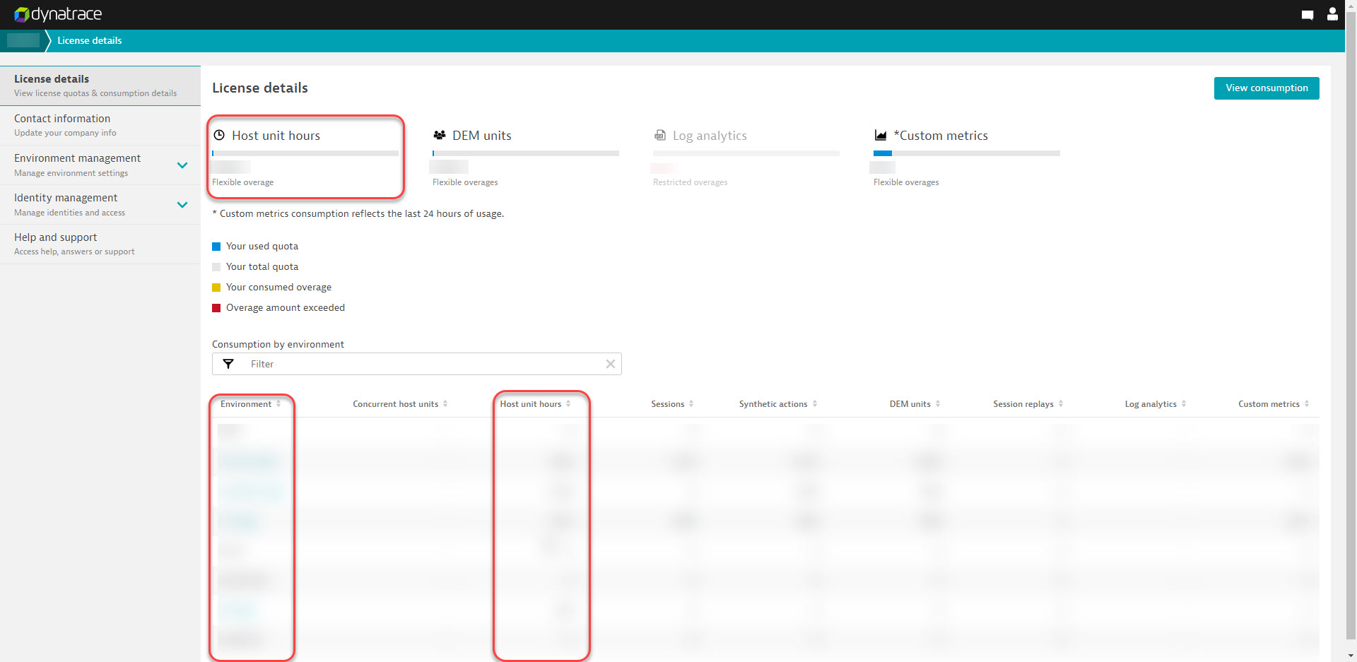
Hello everyone. This use to be possible via the UI and was quite easy, but now you will need to resort to the Environment API for this data to be pulled.
If you are a SAS customer you can also Navigate to the Cluster page, just like in Managed, and see the overall consumption as well as per the environment. This will show as host unit hours or host units - depending on you contract.
-Chad
Reply
Options
- Mark as New
- Subscribe to RSS Feed
- Permalink
12 May 2021 07:38 PM
Is there a way to create this report in an automated manner so the data can be extracted and loaded to a visualization tool or Dynatrace itself?
Options
- Mark as New
- Subscribe to RSS Feed
- Permalink
13 May 2021 01:41 AM
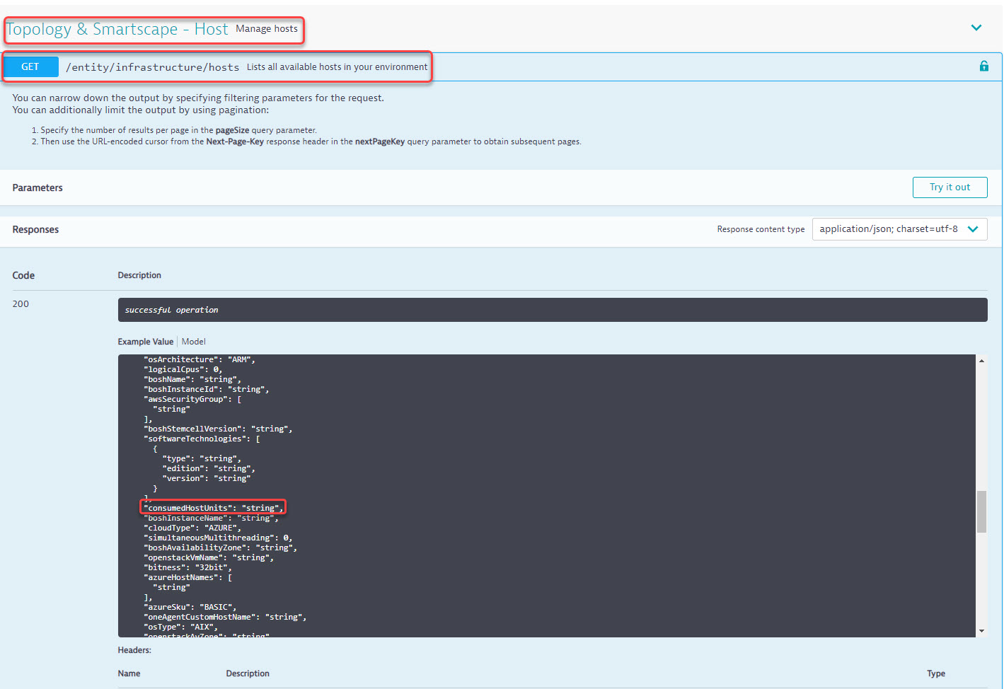
Hi, the tool is first doing an API call to
https://*******.live.dynatrace.com/api/v1/entity/infrastructure/hosts?includeDetails=true
Which returns a JSON doc with lots of fields but the one you care about is consumedHostUnits:
[{
  ...
  "consumedHostUnits": 0.25
  ...
}]
From there, the tool is performing this logic to calculate the different figures.
If you'd like Dynatrace to build this automated report for you, I'd advise speaking to your local Dynatrace Services team lead who will be able to assist.
Reply
Options
- Mark as New
- Subscribe to RSS Feed
- Permalink
08 Dec 2022 10:10 AM
Hello. Is this dashboard still available?
Thanks.
Houston, we have a problem.
Options
- Mark as New
- Subscribe to RSS Feed
- Permalink
08 Dec 2022 01:35 PM
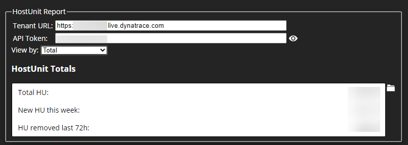
I'm using a custom extension "missing metrics" that calculates the HU consumption per host/hostgroup/tag and reports this back to dynatrace as a metric so we can put it on a dashboard:

The AG extension is rather simple, uses the API to get entities and reports back the overall HU consumption per "licensebucket" tag. If you're interested I can share it.
Certified Dynatrace Master, Dynatrace Partner - 360Performance.net
Reply
Options
- Mark as New
- Subscribe to RSS Feed
- Permalink
08 Dec 2022 01:47 PM
My primary scope is to calculate HU consumption per MZ. Please share it if we can filter consumption per MZ!
Thank you!
Thodoros
Houston, we have a problem.
Options
- Mark as New
- Subscribe to RSS Feed
- Permalink
08 Dec 2022 04:45 PM
@Theodore_x86 I have something similar to @r_weber's solution (not having that as AG extension), you can get the script from here:
https://github.com/Alanata-a-s/Dynatrace-License-Reporting-Scripts
It pushes back metric bound to the hosts, so you can easily then query the sum per MZ in Data Explorer and have that on a dashboard.
Also besides calculating it also can send event in case a host get disabled due to license exhaustion. (One event per host at the moment)
Dynatrace Ambassador | Alanata a.s., Slovakia, Dynatrace Master Partner
Dynatrace License Reporting Scripts. Contribute to Alanata-a-s/Dynatrace-License-Reporting-Scripts development by creating an account on GitHub.
Reply
Options
- Mark as New
- Subscribe to RSS Feed
- Permalink
15 Dec 2022 12:29 PM - edited 15 Dec 2022 12:29 PM
This is great implementation!.
Downloaded the code, set 2 environment variables and run it.
With no time got invaluable information from the dashboard and problems that were created!
Thanks for sharing!
Yos
dynatrace certificated professional - dynatrace master partner - Matrix Soft Ware Division - Israel
Reply
Options
- Mark as New
- Subscribe to RSS Feed
- Permalink
15 Dec 2022 12:39 PM
Thanks for the positive feedback!
Dynatrace Ambassador | Alanata a.s., Slovakia, Dynatrace Master Partner
Reply
Options
- Mark as New
- Subscribe to RSS Feed
- Permalink
10 Feb 2023 04:46 PM
I'd like to get that if possible.
Options
- Mark as New
- Subscribe to RSS Feed
- Permalink
11 Mar 2024 03:00 PM
I Like this data.
Can you please share for me :).
Trying to get HU data from our environment.
It looks like we need more and I trying to see how much more.
Thank you.
Options
- Mark as New
- Subscribe to RSS Feed
- Permalink
30 May 2024 08:51 PM
Hi
Can you share with me the AG extension that you are using?
Pls Slack me at [email protected]
Thank you!
Options
- Mark as New
- Subscribe to RSS Feed
- Permalink
30 May 2024 10:03 PM - edited 30 May 2024 10:07 PM
Hello r_weber,
An ActiveGate extension that pulls Host Units into Dynatrace as a metric broken down by Host Group, tags or Management zones is awesome!
Would you be able to share a link to the Activegate extension that you created?
I know we are shifting into DPS licensing but I have a need to chart classic host unit licensing on a dashboard.
Appreciate it,
Lawrence
Options
- Mark as New
- Subscribe to RSS Feed
- Permalink
15 Aug 2023 04:51 AM
There needs to be an out-of-the box solution for the v2 API.
Reply
Options
- Mark as New
- Subscribe to RSS Feed
- Permalink
25 Mar 2024 08:52 AM
Of course !
It looks API v1 are deprecated.
dt.entity.host on v2 doesn't seems to get the information.
For the moment, as far as I know, there is no way to do it using notebooks or new dashboards with Grail 😕
That's a missing part !
Featured Posts
