- Dynatrace Community
- Ask
- Dashboarding
- How to create custom chart for every splitting of Calculated service metrics?
- Subscribe to RSS Feed
- Mark Topic as New
- Mark Topic as Read
- Pin this Topic for Current User
- Printer Friendly Page
- Mark as New
- Subscribe to RSS Feed
- Permalink
05 May 2021
10:53 AM
- last edited on
31 Aug 2022
10:46 AM
by
![]() MaciejNeumann
MaciejNeumann
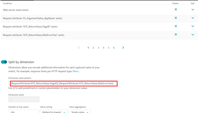
We have a calculated service metrics in which we have few request attributes in Filter and two request attributes in Splitting , Please find below metrics for more details.
This Calculated service metrics are capturing the data like below.
| Flight List | We are not flying on this route. |
| Flight List | There are not any availability on selected dates. |
| Payment |
Please enter the correct card details. |
| Payment | Please enter address details. |
| Payment | Card verification failed. please use different card. |
| Confirm | There is some technical problem, please try after some time. |
Is there any way to create the Custom chart for every page( like Flight list, payment etc) to show all the error messages respective that page?
Note: We have tried it but didn't see any feature where we can filtered the data based on Request attribute in Custom chart.
Solved! Go to Solution.
- Labels:
-
metrics
-
request attributes
- Mark as New
- Subscribe to RSS Feed
- Permalink
05 May 2021 01:28 PM
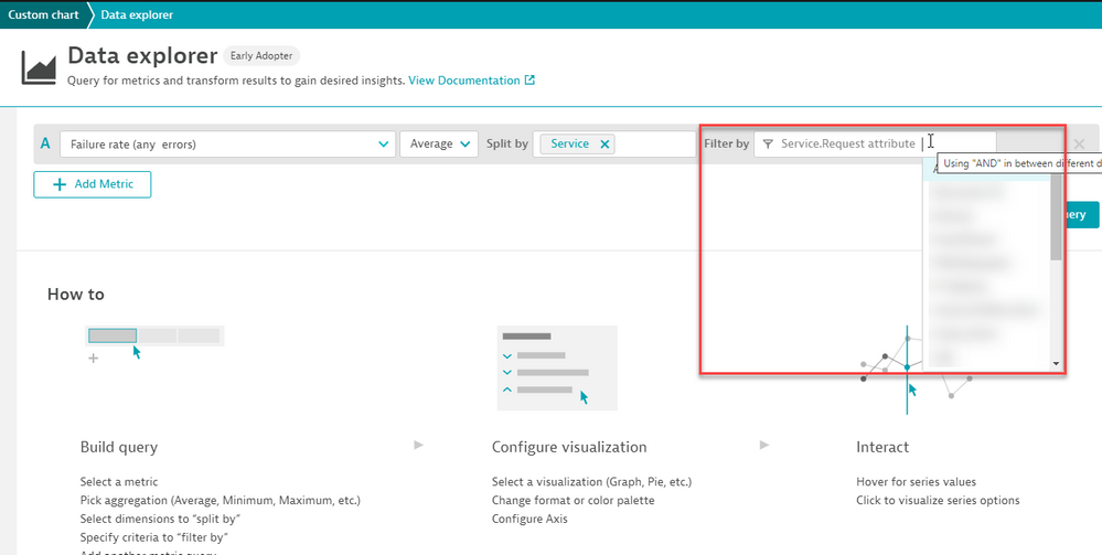
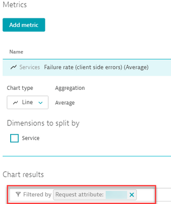
This is possible but you will need to have a metric basis. Are you looking for errors, throughput and so on. Once you define your Main Metric, like failure for example, we can set that for services, then add a filter to only include certain Request Attribute values. This can all be done from the new metrics explorer and from the custom chart via filters:
- Mark as New
- Subscribe to RSS Feed
- Permalink
05 May 2021 05:23 PM
Thanks Chad, for your response.
I have tried this solution but the problem is that filter is not allowing to filter data for specific value of request attribute.
I have SITE_ReturnValue_PageId(which is in splitting in metrics) capturing the data like(Flight list, payment, confirm etc). Suppose I want to create a chart which will show all the messages that occurred on 'Payment' page then I need to add that request attribute in filter like below
But I am not getting this kind of option in Custom chart and Data Explorer as well. We are this option only in Multidimensional Analysis View.
- Mark as New
- Subscribe to RSS Feed
- Permalink
05 May 2021 06:05 PM
Ahh yes, that currently is not available, but I would recommend tossing in a RFE
- Mark as New
- Subscribe to RSS Feed
- Permalink
05 May 2021 06:38 PM - edited 05 May 2021 06:39 PM
Hi @nitin_dumbre ,
what you will need to do this is a multidimensional split (or tags) support in Dynatrace. This is currently not possible with custom service metrics. I have filed an enhancement request for this some time ago, feel free to support/upvote it.
Meanwhile since this is a very limiting issue indeed that other timeseries databases support very well (why oh my not Dynatrace!). I'm using a workaround for this, though with the help of better external analysis and visualization. Here is how:
- Technically every custom service metric is split by only two dimensions: the service and some custom split.
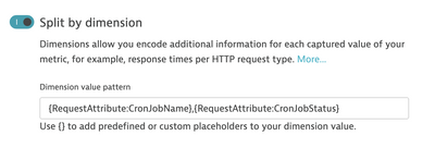
- I'm adding a custom split that is comma-separated like this:
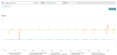
- In the metrics browser you will notice that you have "one" splitting that is now looking like this:
- The I use the metrics/series API to export the datapoints and my exporter recognizes the "special" format of the splitting and really splits it up into separate dimensions. I store that data in a timeseries DB with more flexibility (InfluxDB) and analysis capabilities.
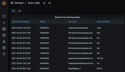
- Then I use a more powerful visualization/graphing engine (Grafana) to display my data with great variety, e.g. as a table with status, jobname and some calculated timing:
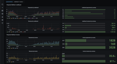
Or if you like a more complex example with 4 dimensions (country, currency, paymenttype,site):(the data is all captured in Dynatrace, but is then stored in InfluxDB and visualized in Grafana for better granularity, data retention and better visualization)
It's a workaround and a bit disappointing but it works well for end-users that are interested in exhaustive data representation 🙂
kr,
Reinhard
Featured Posts
