- Dynatrace Community
- Dynatrace
- Ask
- Open Q&A
- New problem indicator?
- Subscribe to RSS Feed
- Mark Topic as New
- Mark Topic as Read
- Pin this Topic for Current User
- Printer Friendly Page
- Mark as New
- Subscribe to RSS Feed
- Permalink
31 May 2022 10:59 AM
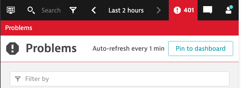
With 1.242, I have started seeing the problem indicator in the top right as the following:
Does the exclamation point have any meaning?
Solved! Go to Solution.
- Labels:
-
davis
-
problem detection
- Mark as New
- Subscribe to RSS Feed
- Permalink
31 May 2022 12:32 PM
I would like to hear about that also as I am sure some execs will ask, but we haven't been upgraded yet. Wonder why not in the release notes? Dynatrace SaaS release notes version 1.242 | Dynatrace Docs
- Mark as New
- Subscribe to RSS Feed
- Permalink
31 May 2022 12:55 PM
Unfortunately, UI changes rarely make their way into the release notes. There are tons of UI changes in 1.242, mostly configuration moved into other places. At least what I have noticed.
- Mark as New
- Subscribe to RSS Feed
- Permalink
31 May 2022 01:26 PM
They should put more in release notes as then people miss things.
- Mark as New
- Subscribe to RSS Feed
- Permalink
31 May 2022 01:04 PM
To best of my knowledge its more towards reading accessibility placing icons and doesn't have additional meaning, however should had been part of release notes.
- Mark as New
- Subscribe to RSS Feed
- Permalink
31 May 2022 02:33 PM
That's just UI, to match the Problem icon, so we can ease see that the red alert is from the problem number.
Maybe, we should expect more data there, vulnerabilities problems, maybe, and it will get a different icon, so we can ease see the numbers from each.
ps, that's a totally guess! 😅
- Mark as New
- Subscribe to RSS Feed
- Permalink
31 May 2022 02:34 PM
Dynatrace!!!!! please provide an explanation of this new icon. I'm getting questions from my users what this new icon indicates. If it doesn't provide an informational value then why was it even added, it's just taking up more screen space and making the number smaller.
- Mark as New
- Subscribe to RSS Feed
- Permalink
31 May 2022 03:12 PM - edited 31 May 2022 03:12 PM
Sorry for the confusion, I was not aware that this change was not accompanied with a release note entry, I will reach out to the responsible team and give them feedback.
Now to the change, and I am pretty sure that the change will be received in a positive way.
First of all: We did not change the behaviour and semantic of the Davis problem indicator on top at all, we just added an icon to distinguish the Davis problem indicator from the upcoming Davis security vulnerabilities.
As we will start to show Security vulnerability indicator number on top as well, we had to come up with an icon to distinguish both indicators.
See below the upcoming Security indicator alongside the Davis Problem indicator:
I hope that explains the reasons for adding an icon on top and I am really sorry that we missed the icon change in our release notes.
Best greetings,
Wolfgang
- Mark as New
- Subscribe to RSS Feed
- Permalink
31 May 2022 03:19 PM
I hit the bulls-eye 🤣
https://community.dynatrace.com/t5/Dynatrace-Open-Q-A/New-problem-indicator/m-p/187477/highlight/tru...
- Mark as New
- Subscribe to RSS Feed
- Permalink
31 May 2022 03:44 PM - edited 31 May 2022 03:45 PM
I'm all for improvements but I wonder what customer input went into this decision. My operations team puts the Dynatrace Problems page on a large screen for monitoring. They've had issue already regarding the visibility of the problem count from a distance, this actually just makes things worse.
The icon provides no significant value, especially to people not paying for the security module. What percentage of your customers have both the Davis and Security module because this may only be helping a small percentage of your customers and impacting the larger percentage.
What's probably the second most important metric Dynatrace could provide, second to knowing a Problem exists? Likely, the number of problems that my monitored environment is currently experiencing, yet that metric is actually a smaller font than the DatePicker text.
- Mark as New
- Subscribe to RSS Feed
- Permalink
31 May 2022 04:08 PM - edited 31 May 2022 04:09 PM
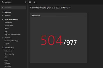
Does the newly introduced resizable problem dashboard tile not help on that use-case? As it can be resized to any size now.
I fear that the indicator number on top is not really visible for wall-mounted displays anyway.
- Mark as New
- Subscribe to RSS Feed
- Permalink
31 May 2022 04:33 PM
Thank you for the suggestion, although in that view the number can be massive, we then lose the details of the problems. If we had the ability to re-create the problems page in a dashboard with all the text attributes we would do that. Although, I'd hope one day to re-create what @dannemca made (amazing work).
I do agree, the problem number on the top right never was ideal but it's all we had. From one screen we need to see the problem details and the total count. Other things as well, but won't get into that here. The best solution at the moment is the Problems page with the static DT header.
Any chance you can add the icon but not shrink the number? There is a lot of dead space between the search bar and problem count. Also, the responsive design could remove the icon maybe if resolution is below 770 pixels wide, which is when the Datetime Picker compresses.
- Mark as New
- Subscribe to RSS Feed
- Permalink
01 Jun 2022 07:11 AM
I got it now, you are speaking purely about the problem feed and not about all the other pages right?
I will check if we can increase the indicator text a bit more.
Another suggestion from my side would be to also show the total number of open problems in the problem header? What do you think. Would that help your ops team? As the header is in large letters anyway this would render the number much more readable.
- Mark as New
- Subscribe to RSS Feed
- Permalink
02 Jun 2022 02:05 PM
@wolfgang_beer thanks for suggesting solutions. If I disagree, doesn't mean I'm not open for deeper discussion.
The initial discussion in general is about the Problem count on the Static Header. The moment the icon was added I received communications from my top end-users voicing the same concern that the number is smaller and the room is being consumed by an icon that doesn't really provide any meaningful value. They commented that the area is always RED (not like it changes RAG) so why not put Security problem counts into a blue or purple background and leave Problems in red and large. If it's for accessibility, then use the ALT tags and a background color with higher contrast.
The conversation then spawned a secondary issue, that of the Operations Team.
Correct, the "problems feed" page is what our Operations team keeps up on a massive monitor 24/7 and then we display on 55" monitors around the building. For them it's all about this page because it's the only option they have to display Problem details.
Suggestion: "Another suggestion from my side would be to also show the total number of open problems in the problem header?"
Response: Unfortunately I think that now puts the problem count on the screen too many times. That would be the 3rd presentation of the number. 1) Top right header, 2) between the bar chart and the problem details table, 3) in the problems header. It would be best to work with what we already have instead of adding a 3rd.
Suggestion: Between the bar chart and problem details table, could you add a few "Problem Stats" horizontally and with maybe a slightly larger text. Say it's 4 responsive design boxes. 1) Total Problems reported in the given timeline and filters 2) Total problems OPEN at the current moment 3) Total HOST Entity Problems Open (or other useful metric) 4) Total Application Entity Problems Open (or other useful metric). This would use existing landlocked white space on the page so it provides benefit without impacting anything else.
Suggestion2: Enlarge the font of the coutn between the bar chart and problem details but just add the text of "Open Problems ####" next to it. e.g. "14 Problems (12 Open)"
- Mark as New
- Subscribe to RSS Feed
- Permalink
02 Jun 2022 02:40 PM
Ok, I had a talk with the team and we will try to increase the size of the indicator number again.
Thanks for all your input.
Regards,
Wolfgang


