- Dynatrace Community
- Ask
- Open Q&A
- Re: Creating Transaction score view in dynatrace
- Subscribe to RSS Feed
- Mark Topic as New
- Mark Topic as Read
- Pin this Topic for Current User
- Printer Friendly Page
- Mark as New
- Subscribe to RSS Feed
- Permalink
15 Nov 2022
06:47 PM
- last edited on
16 Nov 2022
09:38 AM
by
![]() MaciejNeumann
MaciejNeumann
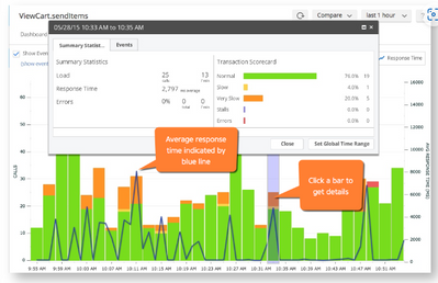
In AppDynamics we have tab called "transaction score", The graph in the tab displays the user experience for the selected business transaction and the bar reflects the total calls, while the color segments green, yellow, and so on indicate the relative number of those calls that are normal, slow, very slow, stall, or errors.
is there a way we can create similar view in Dynatrace? for application APIs
Solved! Go to Solution.
- Labels:
-
business analytics
-
dashboards classic
- Mark as New
- Subscribe to RSS Feed
- Permalink
16 Nov 2022 08:16 PM
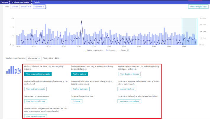
If I were you I would use the Servcie details analysis. You can find the relevant data in many different analysis views. I regulary use the outliers, compare, exception analysis, detail of faliures, response time hotspots.
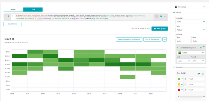
Regarding dashboarding, I could not create your template dashboard. I recommend to try the hetamap for responstime distrubution analysis.
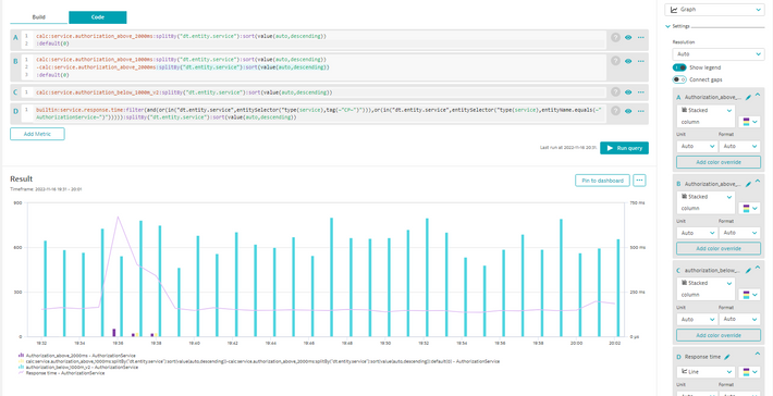
or with combined grahp and column features. For this example I have created three calculated metrics for an individual service.
1. response time below 1 sec,
2. response time above 1 sec,
3. response time above 2 sec
On the dashboard:
A: 3 (bar)
B: 2-3 (bar)
C: 1 (bar)
😧 avg response time (line)
You can see A and B bars, when the response time avg increase.
I hope it helps.
Best regards,
Mizső
Featured Posts


