- Dynatrace Community
- Ask
- Real User Monitoring
- Re: Difference in count when zoomed in (users / sessions)
- Subscribe to RSS Feed
- Mark Topic as New
- Mark Topic as Read
- Pin this Topic for Current User
- Printer Friendly Page
- Mark as New
- Subscribe to RSS Feed
- Permalink
26 Aug 2021
03:34 PM
- last edited on
07 Sep 2021
12:10 PM
by
![]() MaciejNeumann
MaciejNeumann
I am wondering why counts are higher in graphs when timescale is larger (day), then when zoomed in.
I realise when you zoomed in the detail moves from up to minute detail - although that detail doesn't show.
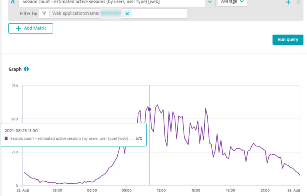
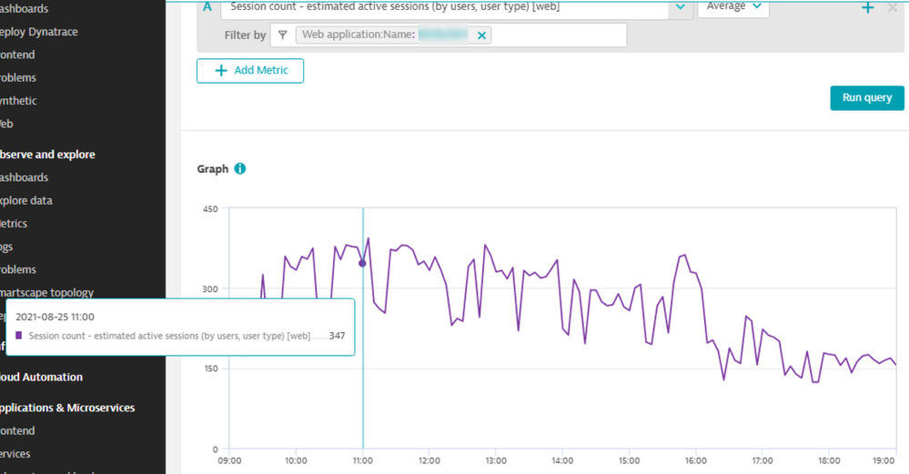
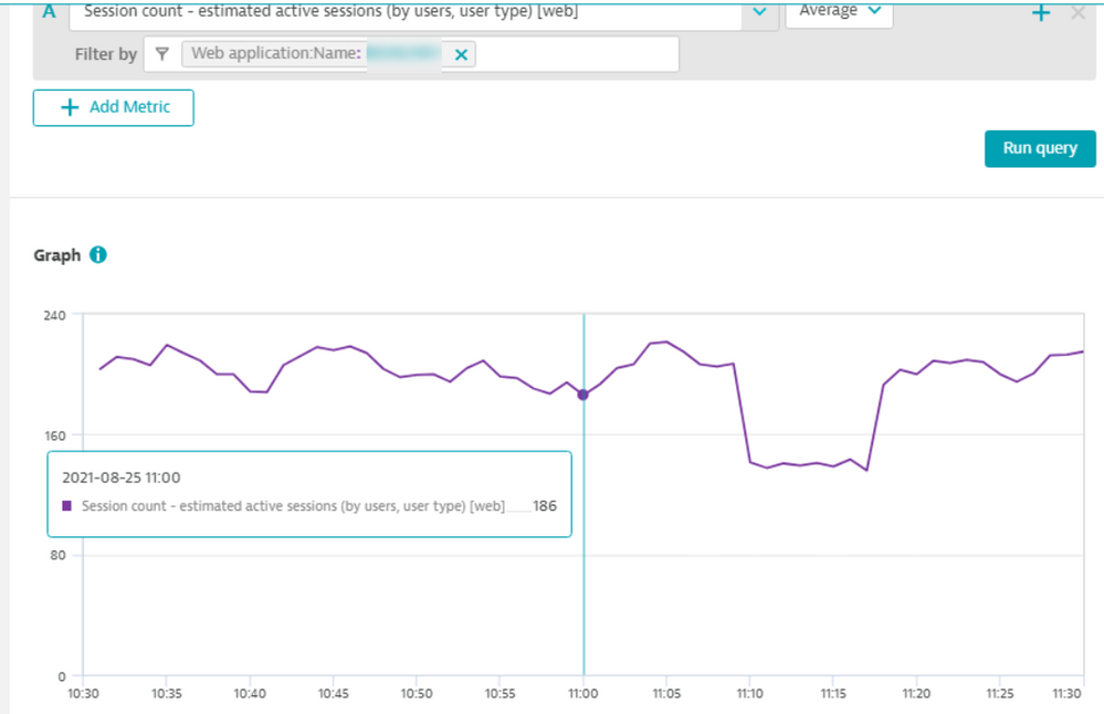
But the information looks distorted that if on day view you think 500+ users are active at 11 AM, but when zoomed in there appear 180 users to be active at 11 AM. You do not expect this behaviour, and when reporting to the user on amount of visitors has to be taken in account.
It appears users/sessions in the displayed time unit are summed, not averaged.
Day view, 11:00, sessions (avg) 570: (5 minute)
Work hours view, 11:00: 347 (5 minute)
Hour view, 11:00: 186 (minute)
Solved! Go to Solution.
- Mark as New
- Subscribe to RSS Feed
- Permalink
27 Aug 2021 11:58 AM
These "Estimated" metrics (sessions count, user count) are a bit specific. I miss exact definition how this "Estimate" is performed. So this is also a bit unclear for me.
Anyhow for different timespans of your graphs, you can look either for Max, Min and Count values for specific time (your 11:00 f.e.). You can then see how is your Average value counted. Even if you zoom into 5 minute timespan (shortest i think) you can see that Count shows several data points for selected 1 minute.
- Mark as New
- Subscribe to RSS Feed
- Permalink
27 Aug 2021 02:11 PM
Also - be sure to validate in Data explorer how large is the "bucket" representing the particular point in the graph. Data explorer in current versions displays only a timestamp 2021-08-25 11:00, but the value is an aggregation (AVG in your case) for an interval. If you move your mouse left for the nearest point, you can see the starting point of the bucket. The displayed timestamp shows the latest value in the bucket. But just from the timestamp, you have no idea how big the bucket is. This is different from the old Custom chart and from MDA where the bucket range is shown (timestamp from - timestamp to).
If you have volatile metrics, you may notice a difference based on zoomed interval.
Featured Posts


