This website uses Cookies. Click Accept to agree to our website's cookie use as described in our Privacy Policy. Click Preferences to customize your cookie settings.
Real User Monitoring
User session monitoring, key user actions - everything RUM.
Turn on suggestions
Auto-suggest helps you quickly narrow down your search results by suggesting possible matches as you type.
- Community Home
- Platform
- Real User Monitoring
- User Flow Report
Options
- Subscribe to RSS Feed
- Mark Topic as New
- Mark Topic as Read
- Pin this Topic for Current User
- Printer Friendly Page
Options
- Mark as New
- Subscribe to RSS Feed
- Permalink
05 Sep 2017 03:41 AM
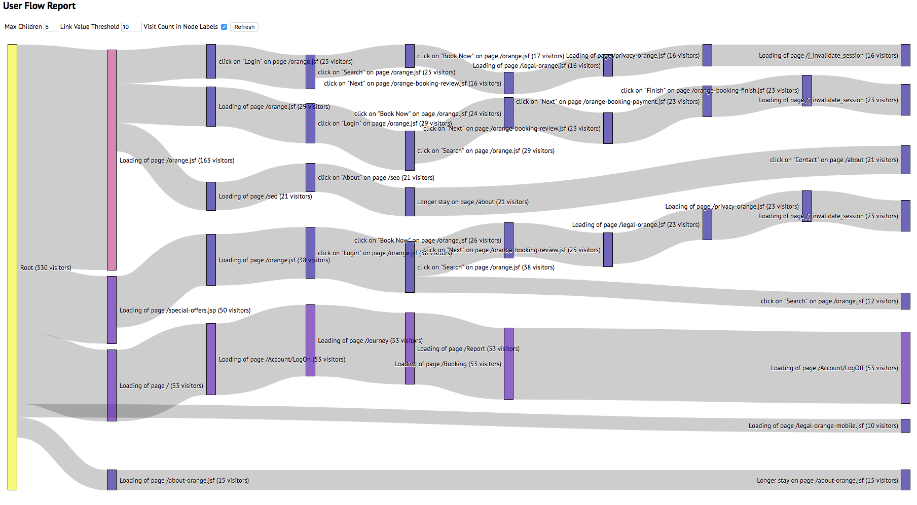
About a year ago, I created a servlet which queried app mon's Purelytics data from Elasticsearch and rendered it as a sankey diagram.
I've written a similar app which parses Dynatrace's user session export data and renders it as a sankey diagram. Unlike the app mon version, this does not rely on Elasticsearch and is therefore easier to deploy.
Here's what it looks like.
The app can be downloaded here.
Solved! Go to Solution.
Labels:
- Labels:
-
extensions
-
user sessions
dynatracevisitflow.zip
253 KB
Reply
3 REPLIES 3
Options
- Mark as New
- Subscribe to RSS Feed
- Permalink
07 May 2020 09:57 PM
this is very cool, Dynatrace now offers a Funnel chart as well for metric graphing
-Chad
Reply
Options
- Mark as New
- Subscribe to RSS Feed
- Permalink
08 May 2020 04:07 PM
Something like this would be REALLY awesome to have inside the platform... sometimes I feel like the funnel is lacking.... since the customization must be done manually. This is like the Service Flow but for user visits ❤️
Reply
Options
- Mark as New
- Subscribe to RSS Feed
- Permalink
04 Aug 2021 08:03 PM
It appears this ZIP no longer is accessible, is it possible to re-upload it somewhere, perhaps on another reply?
Thanks!
Reply
Featured Posts
