Options
- Mark as New
- Subscribe to RSS Feed
- Permalink
17 Jul 2020
07:12 PM
- last edited on
04 Sep 2023
10:18 AM
by
![]() MaciejNeumann
MaciejNeumann
We have had some use cases where users want to define other colors in their charts. As many of you might be aware, Dynatrace provides 5 colors with 3 different shades. that's great but sometimes the line charts tend to blur together with colors. So how do we expand our color selection?
The answer lies with the color selector:
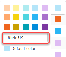
You have the ability to select the color VIA HEX Codes. Check out this link to get the color code of your choice! https://htmlcolorcodes.com/
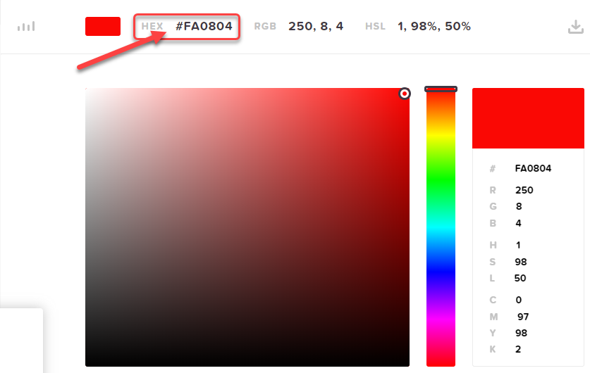
Lets say I want a one of those hosts to be defined by a bright red. I select the color via the HTML color code and I copied the HEX Code. Jump back to Dynatrace and paste that code into the field and press enter!
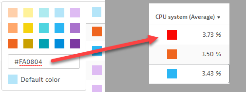
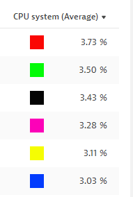
As you can see I have gone ahead and set Red, Green, Black, Pink, Yellow and Blue!
Give it a try! the possibilities are endless!!!!
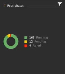
Keep in mind, you can also use this to help convey the status of items in your metrics. A perfect example of this is with Kubernetes Pods. You can create a custom chart that shows the Phases of the Pods. Green = Running, Yellow = Pending, Red= Failed. So right from a glace, staff are fully aware of the Pods status as well as the count of those pods in each status.
The possibilities are endless, so give it a shot, try it out, and have fun doing it!
-Chad
Solved! Go to Solution.
Labels:
- Labels:
-
dashboards classic
-
tips and tricks
1595008320624.png
4 KB
Reply
13 REPLIES 13
Options
- Mark as New
- Subscribe to RSS Feed
- Permalink
17 Jul 2020 07:33 PM
Nice detail! Never had tried it; and it's great it get's propagated to the Dashboards.
Antonio Sousa
Options
- Mark as New
- Subscribe to RSS Feed
- Permalink
17 Jul 2020 07:44 PM
its pretty sweet!
-Chad
Reply
Options
- Mark as New
- Subscribe to RSS Feed
- Permalink
17 Jul 2020 07:58 PM
I hope Everyone leverages this along with the use of emojis to make their dashboards more intuitive and user friendly
-Chad
Not the solution
Reply
Options
- Mark as New
- Subscribe to RSS Feed
- Permalink
17 Jul 2020 09:51 PM
Well done! You know, I can't tell you how many times I have gone to use a pure red and it's not there and honestly, I never even thought about the fact that you can use the HEX box until you pointed it out with this. Good stuff! I do use emojis often.
Reply
Options
- Mark as New
- Subscribe to RSS Feed
- Permalink
17 Jul 2020 09:57 PM
Thanks Larry! im glad that you will be able to benefit form this pro tip as well!
-Chad
Reply
Options
- Mark as New
- Subscribe to RSS Feed
- Permalink
31 Mar 2021 10:20 PM
Does anyone know when this will de possible in the "Data explorer"?
Antonio Sousa
Reply
Options
- Mark as New
- Subscribe to RSS Feed
- Permalink
01 Apr 2021 01:03 PM - edited 17 Dec 2021 04:29 PM
I have not heard of this yet. Currently in the Data explorer, you can only select color scheme sets. The has been talk about a honeycomb tile for the charting of custom metrics but no official ETA on that.
Custom Color Schema's are coming in Q1 2022
-Chad
Not the solution
Reply
Options
- Mark as New
- Subscribe to RSS Feed
- Permalink
26 Jul 2021 03:10 PM
Hi @ChadTurner
Very nice pro tip, but (as Antonio said) sad to see that is not exported in the "Data explorer"?
Sharing Knowledge
Options
- Mark as New
- Subscribe to RSS Feed
- Permalink
13 Dec 2021 03:21 PM - edited 13 Dec 2021 03:24 PM
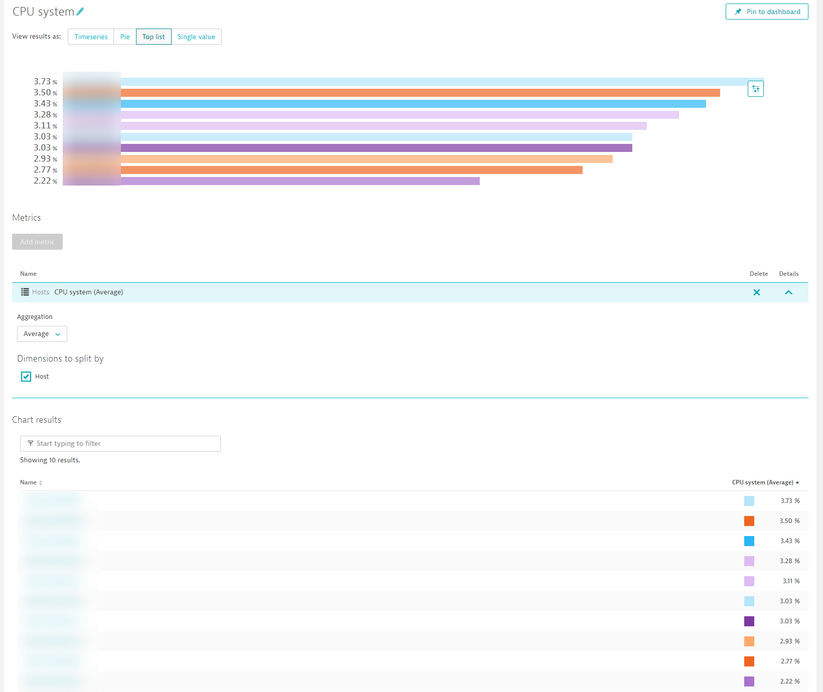
And soon in early Q1 in the Data explorer, say hello to color overrides:


Reply
Options
- Mark as New
- Subscribe to RSS Feed
- Permalink
13 Dec 2021 03:58 PM
@zietho SWEET!!! 

-Chad
Options
- Mark as New
- Subscribe to RSS Feed
- Permalink
13 Dec 2021 06:27 PM
So, so nice! Almost all of the Custom Chart features will now be there 
Antonio Sousa
Options
- Mark as New
- Subscribe to RSS Feed
- Permalink
13 Dec 2021 06:29 PM
Almost, we are working on stacked graph (bar, area) at the moment as well. And dashboard filters are next such that also ingested metrics are filtered.... and and and.. Q1 and early q2 will be hopefully feature rich ;).
Reply
Options
- Mark as New
- Subscribe to RSS Feed
- Permalink
14 Dec 2021 06:15 AM
@zietho Thanks for the Update,
 Huge work wait us to update the existing Dashboards.
Sharing Knowledge


