- Dynatrace Community
- Ask
- Dashboarding
- Create a dashboard tile for periods of no service load
- Subscribe to RSS Feed
- Mark Topic as New
- Mark Topic as Read
- Pin this Topic for Current User
- Printer Friendly Page
- Mark as New
- Subscribe to RSS Feed
- Permalink
31 Mar 2022
02:11 PM
- last edited on
25 May 2023
11:39 AM
by
![]() Michal_Gebacki
Michal_Gebacki
Hi,
we are monitoring the service load on a specific service. That service receives an almost constant load of requests, but occasionally we have short (10-15-20 minutes) periods of time with no load.
I need to understand if it's possible to create a tile (or something else) showing all those periods. I know that we can alert on such occasions, but what I want to achieve here is more like an awareness report for all periods with no requests incoming to our service.
Is such a thing achievable?
Thank you in advance!
Solved! Go to Solution.
- Mark as New
- Subscribe to RSS Feed
- Permalink
31 Mar 2022 03:23 PM
So yes you can. You can also create a custom alert to raise a problem card when data is missing via the Custom events for alerting. That will be the best way to notify your Team(s) when data is missing.
You can also create a a top list of the services but sort it descending so the ones with Zero data is at the top. You can also accompany this tile with a graph tile showing the same thing but it will provide the user with a timeline of when data dropped out.
- Mark as New
- Subscribe to RSS Feed
- Permalink
31 Mar 2022 04:36 PM
Hi @ChadTurner ,
Thank you for the reply!
I'm not interested in custom alerting here, as I don't want to be alerted for such drops in the load. I just need to have a quick overview of those periods at the end of the month, for example.
I tried the top list, but I'm unsure it will help either. I only have one service, which sometimes doesn't receive any load.
Do you think something can be created based on the above scenario?
- Mark as New
- Subscribe to RSS Feed
- Permalink
31 Mar 2022 05:18 PM
Hi @vlazarova
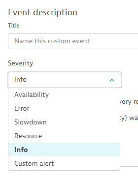
what you could try is instead of generating problems with events you can also just push an Info Event.
So at the end of the month or week you could check whenever the threshold was broken on the Service Overview page (below example shows Process events on the Host overview page)
Another feature you can try out is to subscribe to your Dashboard, this will send you an email at the beginning of each week or every first Monday of the month, this way you will automatically receive a nice summary of your dashboards directly to your email.
What I am afraid of is that Dynatrace will aggregate datapoints over a longer timeperiod and your outages look pretty short so I am not super sure that you will be able to view all of these drops in the weekly report.
Also as a side note, may I recommend the newer upgraded Explore Data graphs (from your screenshot I am assuming you are still using the Custom Chars)?
They offer way more possibilities to visualize data and with the Code Tab you will be able to customize the Data shown in the Tiles to a very fine grain.
Hope this helps !
Best,
Mark
- Mark as New
- Subscribe to RSS Feed
- Permalink
06 Apr 2022 02:46 PM
Hi @mark_bley ,
Thank you for the suggestions!
I was thinking the same thing about using the Info events. As of now I don't see any other way to achieve my goal.
I will make sure to check the new data graphs, even though I'm not sure if it's up to my capabilities to use their whole ponential 🙂
Best regards,
Violeta
Featured Posts


