- Dynatrace Community
- Learn
- Dynatrace tips
- Pro Tip - How to use other colors in charts and graphs!
- Subscribe to RSS Feed
- Mark Topic as New
- Mark Topic as Read
- Pin this Topic for Current User
- Printer Friendly Page
- Mark as New
- Subscribe to RSS Feed
- Permalink
17 Jul 2020
07:12 PM
- last edited on
04 Sep 2023
10:18 AM
by
![]() MaciejNeumann
MaciejNeumann
We have had some use cases where users want to define other colors in their charts. As many of you might be aware, Dynatrace provides 5 colors with 3 different shades. that's great but sometimes the line charts tend to blur together with colors. So how do we expand our color selection?
The answer lies with the color selector:
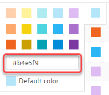
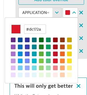
You have the ability to select the color VIA HEX Codes. Check out this link to get the color code of your choice! https://htmlcolorcodes.com/
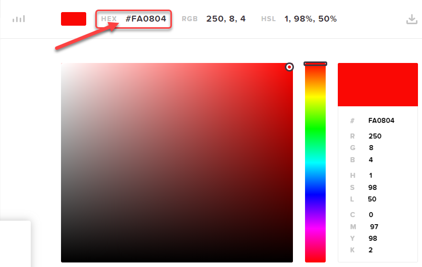
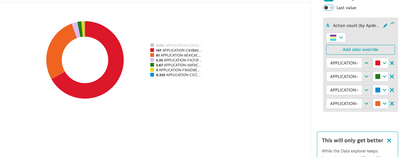
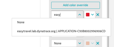
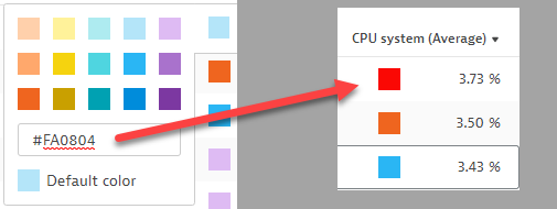
Lets say I want a one of those hosts to be defined by a bright red. I select the color via the HTML color code and I copied the HEX Code. Jump back to Dynatrace and paste that code into the field and press enter!
As you can see I have gone ahead and set Red, Green, Black, Pink, Yellow and Blue!
Give it a try! the possibilities are endless!!!!
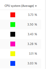
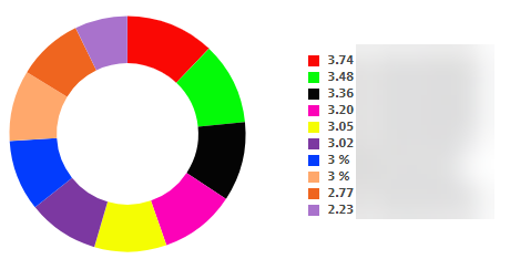
Keep in mind, you can also use this to help convey the status of items in your metrics. A perfect example of this is with Kubernetes Pods. You can create a custom chart that shows the Phases of the Pods. Green = Running, Yellow = Pending, Red= Failed. So right from a glace, staff are fully aware of the Pods status as well as the count of those pods in each status.
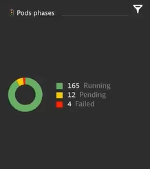
The possibilities are endless, so give it a shot, try it out, and have fun doing it!
Solved! Go to Solution.
- Labels:
-
dashboards classic
-
tips and tricks
- Mark as New
- Subscribe to RSS Feed
- Permalink
17 Jul 2020 07:33 PM
Nice detail! Never had tried it; and it's great it get's propagated to the Dashboards.
- Mark as New
- Subscribe to RSS Feed
- Permalink
17 Jul 2020 07:44 PM
its pretty sweet!
- Mark as New
- Subscribe to RSS Feed
- Permalink
17 Jul 2020 07:58 PM
I hope Everyone leverages this along with the use of emojis to make their dashboards more intuitive and user friendly
- Mark as New
- Subscribe to RSS Feed
- Permalink
17 Jul 2020 09:51 PM
Well done! You know, I can't tell you how many times I have gone to use a pure red and it's not there and honestly, I never even thought about the fact that you can use the HEX box until you pointed it out with this. Good stuff! I do use emojis often.

- Mark as New
- Subscribe to RSS Feed
- Permalink
17 Jul 2020 09:57 PM
Thanks Larry! im glad that you will be able to benefit form this pro tip as well!
- Mark as New
- Subscribe to RSS Feed
- Permalink
31 Mar 2021 10:20 PM
Does anyone know when this will de possible in the "Data explorer"?
- Mark as New
- Subscribe to RSS Feed
- Permalink
01 Apr 2021 01:03 PM - edited 17 Dec 2021 04:29 PM
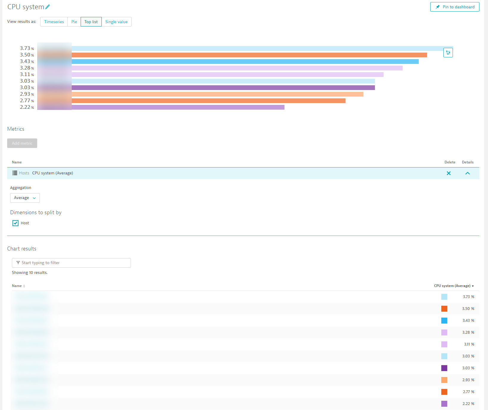
I have not heard of this yet. Currently in the Data explorer, you can only select color scheme sets. The has been talk about a honeycomb tile for the charting of custom metrics but no official ETA on that.
Custom Color Schema's are coming in Q1 2022
- Mark as New
- Subscribe to RSS Feed
- Permalink
26 Jul 2021 03:10 PM
Hi @ChadTurner
Very nice pro tip, but (as Antonio said) sad to see that is not exported in the "Data explorer"?
- Mark as New
- Subscribe to RSS Feed
- Permalink
13 Dec 2021 03:21 PM - edited 13 Dec 2021 03:24 PM
And soon in early Q1 in the Data explorer, say hello to color overrides:
- Mark as New
- Subscribe to RSS Feed
- Permalink
13 Dec 2021 03:58 PM
@zietho SWEET!!! ![]()
![]()
- Mark as New
- Subscribe to RSS Feed
- Permalink
13 Dec 2021 06:27 PM
So, so nice! Almost all of the Custom Chart features will now be there ![]()
- Mark as New
- Subscribe to RSS Feed
- Permalink
13 Dec 2021 06:29 PM
- Mark as New
- Subscribe to RSS Feed
- Permalink
14 Dec 2021 06:15 AM
@zietho Thanks for the Update,
![]() Huge work wait us to update the existing Dashboards.
Huge work wait us to update the existing Dashboards.
Featured Posts
