- Dynatrace Community
- Ask
- Dashboarding
- Changes to the 'Single Value' tile feedback
- Subscribe to RSS Feed
- Mark Topic as New
- Mark Topic as Read
- Pin this Topic for Current User
- Printer Friendly Page
- Mark as New
- Subscribe to RSS Feed
- Permalink
26 Nov 2021
11:10 AM
- last edited on
31 May 2023
10:23 AM
by
![]() Michal_Gebacki
Michal_Gebacki
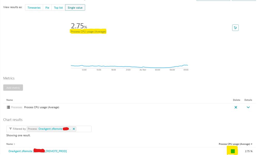
I am really beginning to despair with the decisions that Dynatrace are making with their dashboarding capabilities. The most recent debacle in my view (I'm willing to shown an opposing view) are the changes to the 'Single Value' Tile.
Go back to last year the Single Value Tile would show and allow the following:
It would show the Metric Name
It would show the Aggregation Used
It would allow a colour (Any colour!!) to be set. Company colour scheme? No problem.
Now this week a new version has been released and what extra benefits do we get with this?
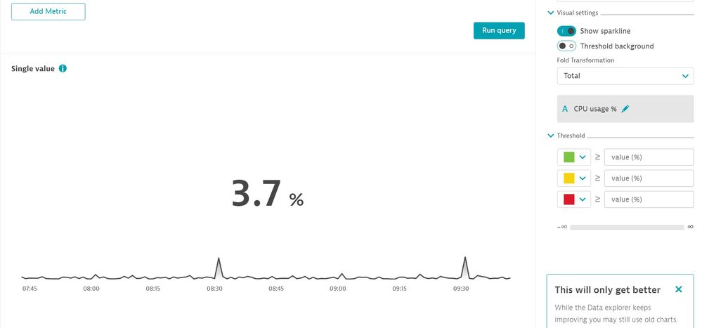
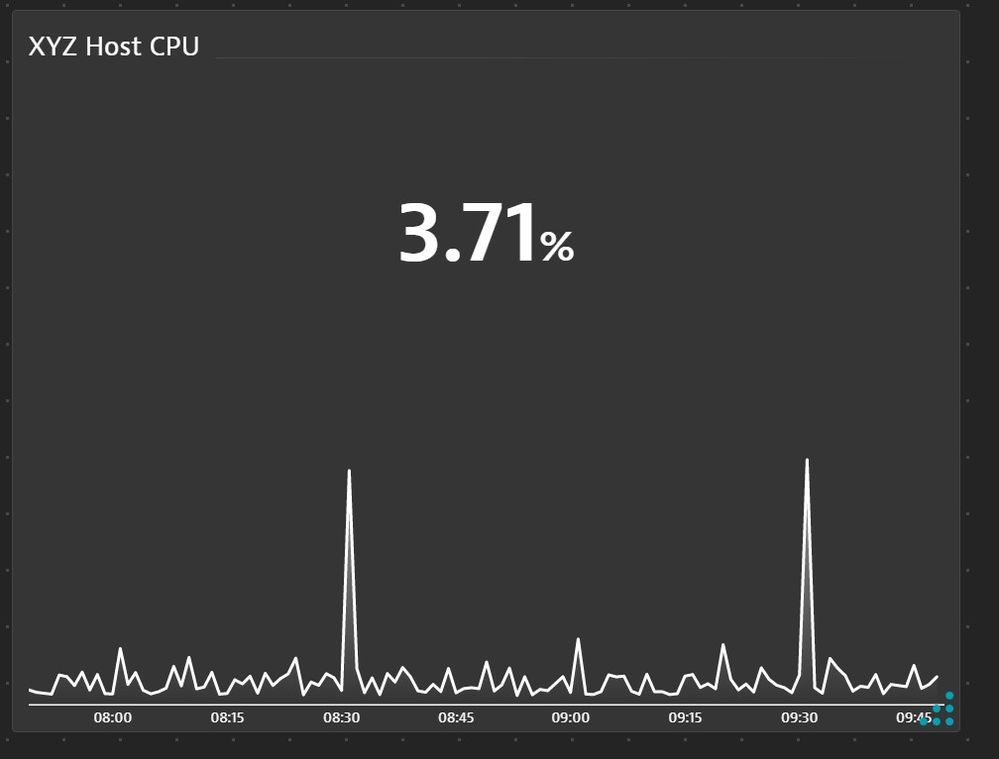
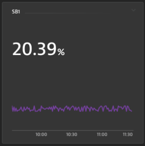
Show Sparkline: A shaded line that can be any colour you want so long as that's Black in design view and White when put in a dashboard. Never mind about being able to use Company colours schemes! Also the only line allowed is now the Sparkline. If this is toggled off you have no line at all.
No metric text. We can no longer see what the Metric name is or the Aggregation used. Yes this could get in the way sometimes. But a toggle to make this visible or not would have sorted that. I could put this detail in the title but then usually you want these tiles to be small, so long titles with this information would be lost.
Now I'll admit perhaps I'm being very picky but I've reached my limit. I've watched slowly but surely all the useful functionality being withdrawn that would allow me to create some very bespoke and useful charts. Where data was immediately understandable and accessible. Without having to click into a chart to understand what it was now showing you.
Is there now a design policy in Dynatrace where the users are no longer expected to think and that Dynatrace will make all the design decisions for us? (Apple!)
I'm keen to understand what other users feelings are about this and what are your expectations going forward. I'm also keen to understand why Dynatrace thought this was an improvement. As they keep showing the design view that "This will only get better". It's not from where I'm sitting.
Rant over...
Solved! Go to Solution.
- Labels:
-
dashboards classic
-
metrics
- Mark as New
- Subscribe to RSS Feed
- Permalink
26 Nov 2021 12:30 PM
I may disagree with you on this.
You are comparing the old "custom chart" with the new Explore Data.
The old Single Value widget from Explore Data was really "bad" and this enhancement made it look like the one you show on custom chart.
Before we got only the single value, literally. Now we have the value, the history trend on background, and the next improvement will be the "compare" feature, where you can see how much % the current value is compared to last timeframe.
You can rename the widget to show the metric used, since is a single metric widget.
About the colors, this can be done using thresholds.
I was not happy at the beginning when the started to change from old custom chart to this new Explore Data, and now I get it, it was just a matter of adjustments and get used to it.
That's my feedback about this.
- Mark as New
- Subscribe to RSS Feed
- Permalink
26 Nov 2021 01:29 PM
Hello,
Thank you you for your view. Can you explain your statement regarding colours?
"About the colors, this can be done using thresholds."
The Threshold settings as far as I can see are just for the background and this just a RAG status. i.e. Red, Amber & Green. This does not allow for a custom colour to be set for the data metric line. Or am I missing something here?
- Mark as New
- Subscribe to RSS Feed
- Permalink
26 Nov 2021 01:50 PM
You are right, thresholds are limited to 3 colors only, which makes sense for its purpose, but not for customization as users needs.
- Mark as New
- Subscribe to RSS Feed
- Permalink
26 Nov 2021 04:02 PM - edited 26 Nov 2021 04:20 PM
First off,
I am sorry that you feel this way, obviously not our intention! Trust me if I tell you this, the single value tiles, among many other things, are small and quick "improvements" we work on hard to ship them fast, while also extending the Data explorer in parallel, so that it will be better than Custom charting (CC) has ever been.
BUT, to be fair, you should not compare the CC tile with the new Data explorer tile.
A fair comparison would be comparing the old Data explorer tile to the new one.
Let me walk you through:
Before DT version 1.230
The only options you had was to display a "trendline" or not.
While - acknowledged - you where able to color the trendline using the color palette, which we removed.
With DT version 1.230
We revamped this with the following things in mind:
- bigger font!
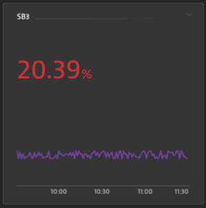
- Additional tile background coloring with thresholds - such that you can easily spot issue with KPIs on NOC screens. The reason why for now, we removed the coloring of the sparkline to make things easier at this point. This however means, we might add this option again in the next iteration (see future below).
- Centered numbers, cauz it just looks way nicer!
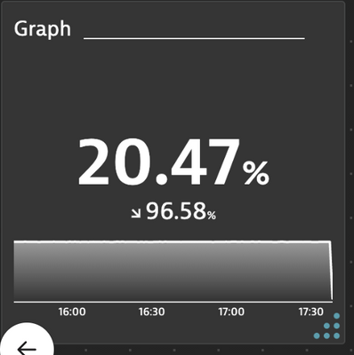
- an added true sparkline, a true "trendline" that starts at 0 on the y axis because before it was auto scaled and in cases distorted the actual trend! So we changed it intentionally to be like on stock ticker tiles.
With DT version 1.231 (because we it did not make it into 230)
- we added the option to show a simple trend.
1.232 - the hack!
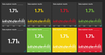
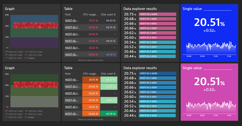
With this version we go a bit crazier with colors and allow custom threshold colors. So you can do things like that:
Might a bit aid your theming need?
Future for Single value (rather late next year though)
For now we stopped, because we are working on generic honeycombs.
Nevertheless, we already have a second bigger iteration in mind than potentially covering some of the following leftover topics:
- dynamic labels (like the one you have seen in Custom charting) and more ;).
- pre and suffix possibilities
- also coloring for the trend number itself (red, green, amber)
- coloring for the sparkline and number again.
So to conclude I hope at this point you can share "our" vision and you believe me when I tell you this... the future will be bright and "colorful"!
Looking forward to your feedback, because your words matter to us!
cheers
Thomas
Featured Posts
