- Dynatrace Community
- Ask
- Dashboarding
- Re: Dashboards with multiple aggregations
- Subscribe to RSS Feed
- Mark Topic as New
- Mark Topic as Read
- Pin this Topic for Current User
- Printer Friendly Page
- Mark as New
- Subscribe to RSS Feed
- Permalink
18 Nov 2021
02:59 AM
- last edited on
31 May 2023
10:58 AM
by
![]() Michal_Gebacki
Michal_Gebacki
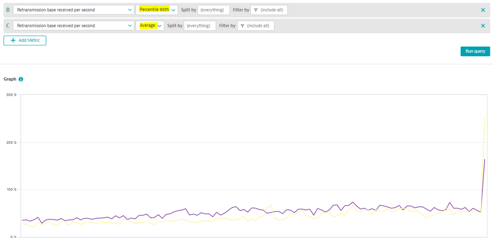
I had a support ticket because I tried to have a chart on a dashboard with average and 90% values of the same custom metric, but they both would not display at the same time. Was told that I needed to put them on two separate charts.
They should be allowed on the same chart - other combinations of avg, max, and count are allowed.
Solved! Go to Solution.
- Labels:
-
dashboards classic
-
metrics
- Mark as New
- Subscribe to RSS Feed
- Permalink
18 Nov 2021 07:41 AM
Hello @gfishman
I just gave it a try with one of the built-in metrics and it works together for both aggregations. What type of custom metric do you have?
Regards,
Babar
- Mark as New
- Subscribe to RSS Feed
- Permalink
18 Nov 2021 02:08 PM
It's a response time on a calculated service metric, for Database Service Type filtered on a particular sql statement
- Mark as New
- Subscribe to RSS Feed
- Permalink
30 Nov 2021 03:40 PM
Hey @gfishman,
can you please provide more details because as @Babar_Qayyum points out that should work Could you maybe send me your support ticket?
regards
Thomas
- Mark as New
- Subscribe to RSS Feed
- Permalink
30 Nov 2021 09:41 PM
Support ticket
- Mark as New
- Subscribe to RSS Feed
- Permalink
20 Jul 2022 10:51 PM - edited 20 Jul 2022 10:52 PM
Sorry, I missed your reply! I have checked your referenced ticket and triggered a review of it internally with the backend team responsible because I don't understand why it should be possible with all other metrics but not with the one you're using. I'd argue that's a bug! In the meantime, have you tried to do plot it again? So is it still happening that you don't see it? Just to be sure.
Again, I am sorry for missing your reply!
regards
Thomas
- Mark as New
- Subscribe to RSS Feed
- Permalink
21 Jul 2022 09:16 AM - edited 21 Jul 2022 09:24 AM
The issue is not that Dynatrace cannot chart both values at the same time. The issue is that the values are identical. Let me explain.
Unless configured otherwise in the Code mode tab, the Data Explorer performs a space aggregation on the metric datapoints. After applying such a space aggregation in Dynatrace, you can use all available aggregations on the transformed data. In many cases, this behavior is reasonable, but there are pitfalls.
For example, consider a counter metric that natively only supports the aggregation value. The metrics has the dimension host and the following values per host:
| timeslot1 | |
| HOST-1 | 1 |
| HOST-2 | 5 |
| HOST-3 | 2 |
After applying a space aggregation, the per host values are merged and you can chart the min (= 1), the max (= 5), the sum (= 8), the avg (= 2.66) and so on. Also the percentiles are calculated based on the three values. Reasonable, isn't it?
In contrast, let's assume there is only the series for HOST-1 available and no additional series/dimensions. After applying the space aggregation, you can again apply all aggregations. However, as there is only one series, the space aggregation does in fact not aggregate any values. Consequently, the values for avg, min, max, sum as well as the percentiles are the same (i.e., 1 for the example above).
The issue is also described on the Metrics API FAQ page.
Featured Posts

