This website uses Cookies. Click Accept to agree to our website's cookie use as described in our Privacy Policy. Click Preferences to customize your cookie settings.
Dashboarding
Dynatrace dashboards, notebooks, and data explorer explained.
Turn on suggestions
Auto-suggest helps you quickly narrow down your search results by suggesting possible matches as you type.
- Community Home
- Platform
- Dashboarding
- Re: How can I get percentile results on "time spent on calls" in Services metrics
Options
- Subscribe to RSS Feed
- Mark Topic as New
- Mark Topic as Read
- Pin this Topic for Current User
- Printer Friendly Page
Options
- Mark as New
- Subscribe to RSS Feed
- Permalink
23 Jun 2020
08:09 AM
- last edited on
31 Aug 2022
10:52 AM
by
![]() MaciejNeumann
MaciejNeumann
Currently i see only "Sum" of the time spent on the calls metrics of Dynatrace Managed in "Services" category of Custom charts.
We are looking for an aggregation on percentiles to create charts for visualizing the slowest requests.
Solved! Go to Solution.
Labels:
- Labels:
-
data explorer
-
services classic
Reply
5 REPLIES 5
Options
- Mark as New
- Subscribe to RSS Feed
- Permalink
23 Jun 2020 08:22 AM
Hi @Deekshit P.
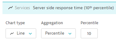
From custom charts you can pick server side response time metric and change the aggregation to percentile
HTH
Yos
dynatrace certificated professional - dynatrace master partner - Matrix Soft Ware Division - Israel
Reply
Options
- Mark as New
- Subscribe to RSS Feed
- Permalink
23 Jun 2020 12:03 PM
I am still not able to see the results for my key request.
This is a custom service which has only "time spent", but not "response times"
Options
- Mark as New
- Subscribe to RSS Feed
- Permalink
23 Jun 2020 03:12 PM
Can you explain please where you see time spent?
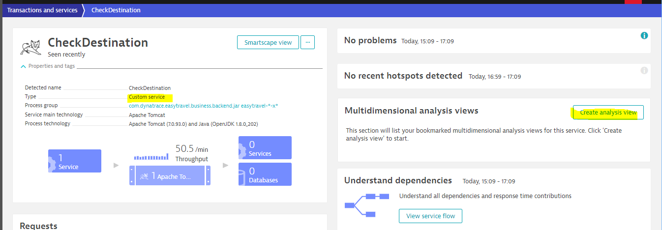
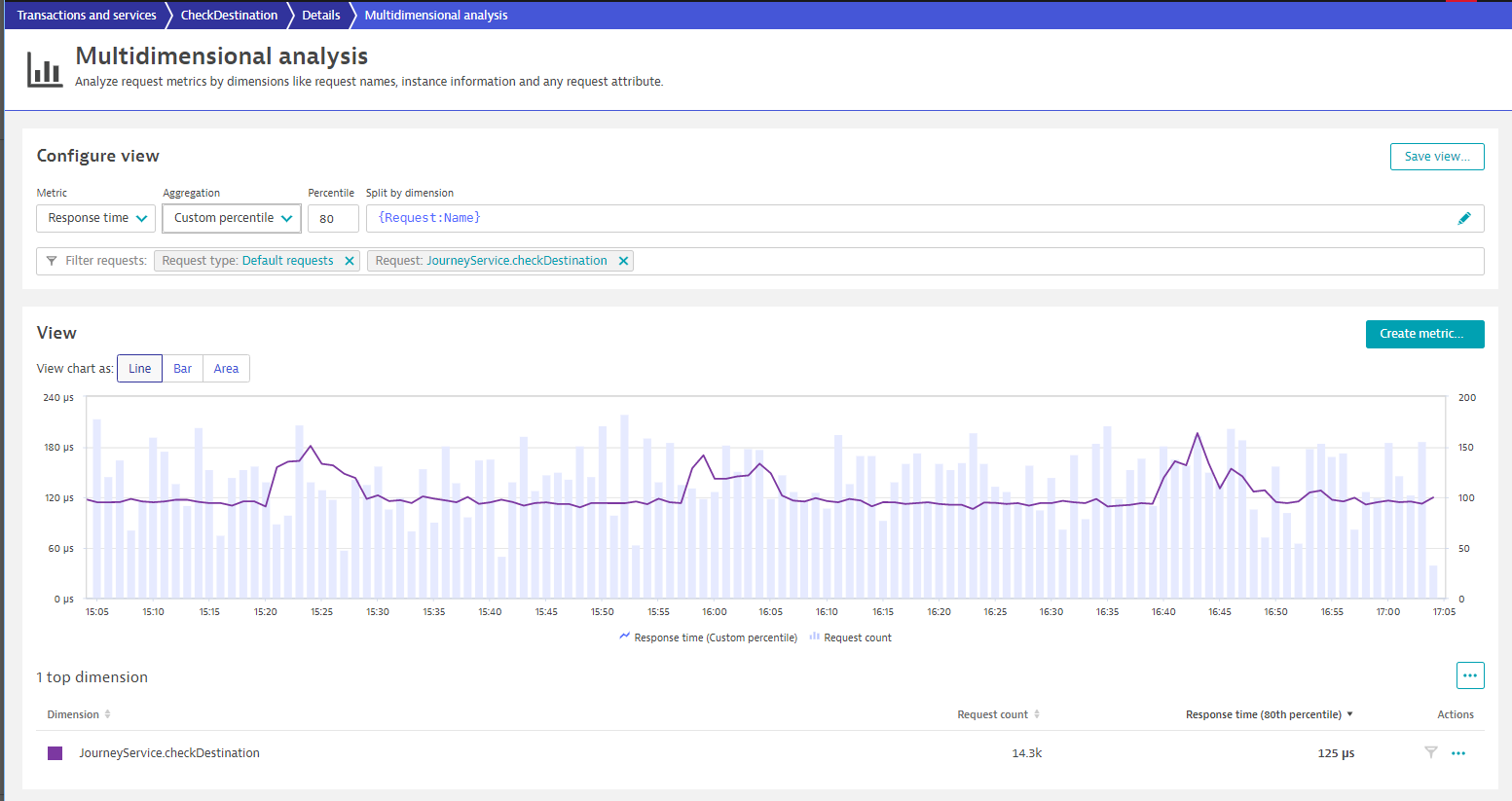
Any how if you look at a service , also custom one as the follows, you can go and "create analysis view" under Multidimensional analysis section
And here you can also chart the response time by percentiles
 HTH
HTH
Yos
dynatrace certificated professional - dynatrace master partner - Matrix Soft Ware Division - Israel
Options
- Mark as New
- Subscribe to RSS Feed
- Permalink
24 Jun 2020 06:31 AM
I think I can see this metrics in Multidimensional analysis but I cannot use this metric to create a chart in dashboard for reporting.
Reply
Options
- Mark as New
- Subscribe to RSS Feed
- Permalink
30 Jun 2020 09:41 PM
There is not a way to pin a list of individual request response times to a tile on a dashboard. If you make all of the requests you care about key requests, you can make a custom chart using the 'key requests' response time metric and then filtering down to the service tag you care about. Otherwise, your best bet is to create a Multidimensional Analysis View, and then create a hyperlink to it on your dashboard with the markdown tile.
Reply
Featured Posts
