- Dynatrace Community
- Ask
- Dashboarding
- Re: How to create dual axis chart in OneAgent
- Subscribe to RSS Feed
- Mark Topic as New
- Mark Topic as Read
- Pin this Topic for Current User
- Printer Friendly Page
- Mark as New
- Subscribe to RSS Feed
- Permalink
29 Aug 2018 12:29 PM
Hi Jiten,
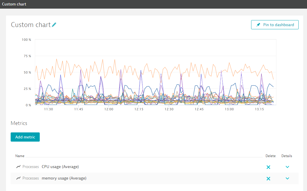
Dynatrace automatically adds a second axis to your custom chart if there are different underlying units for these measures. So if you add two measures that are based on percentages, Dynatrace will assume that they are comparable and show them with a shared axis:

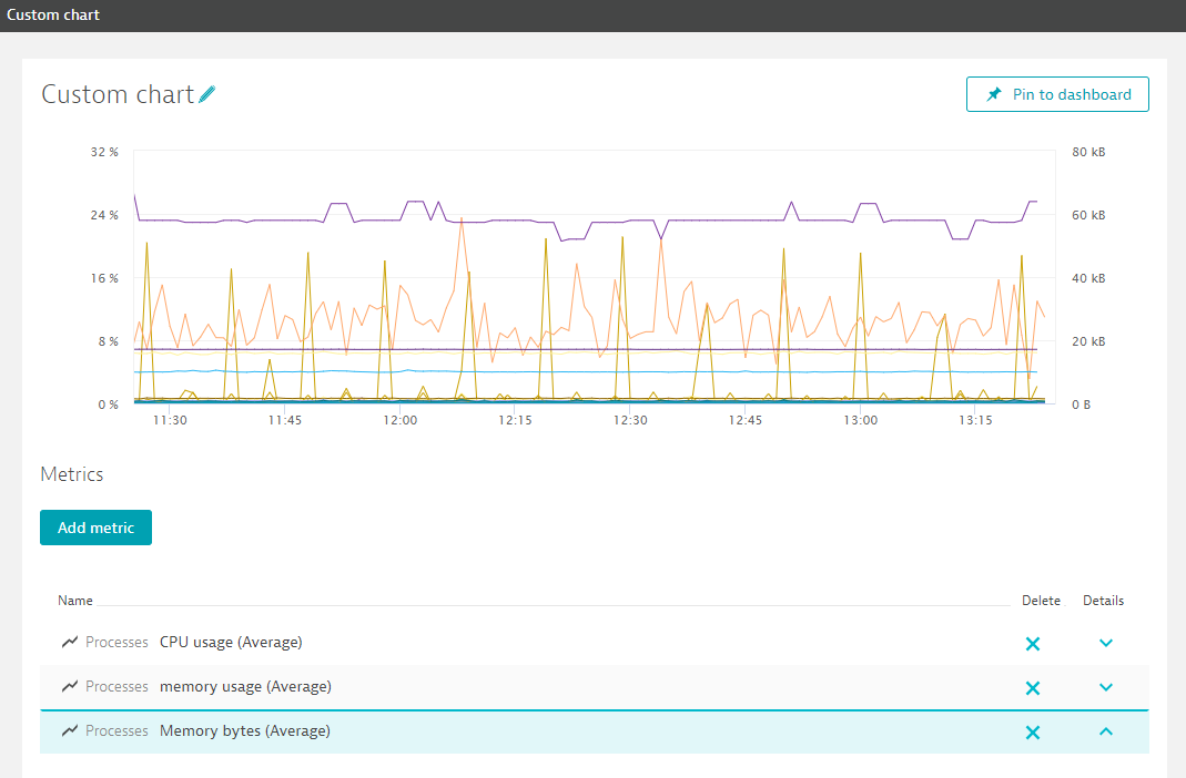
If you add another measure with a different unit, Dynatrace will add a second axis:

I'm not aware of a way to force the creation of two separate axes. In the "planned enhancements for custom dashboards"
thread there is a mid term improvement listed though:
- Configure y-axis for metric
So this is probably already on the roadmap. You can find more information about creating custom charts in the documentation:
https://www.dynatrace.com/support/help/insight-dis...
Featured Posts
