- Dynatrace Community
- Ask
- Dashboarding
- I want to create a tile in Dashboard that gives me top 10 requests by response time
- Subscribe to RSS Feed
- Mark Topic as New
- Mark Topic as Read
- Pin this Topic for Current User
- Printer Friendly Page
- Mark as New
- Subscribe to RSS Feed
- Permalink
19 Sep 2017
11:15 PM
- last edited on
11 May 2021
09:24 AM
by
![]() MaciejNeumann
MaciejNeumann
I am using Dynatrace Managed. I want to create a tile in Dashboard that gives me top 10 requests by response time . It was easy to do in AppMon but I am trying to figure the way in Dynatrace Managed. Can someone who has done this help here ?
Solved! Go to Solution.
- Labels:
-
dashboards classic
-
request attributes
- Mark as New
- Subscribe to RSS Feed
- Permalink
21 Sep 2017 05:01 PM
Hey @Srivathsan S. you can create a custom chart. Use the service requests - response time metric. It will auto sort by response time (median). Pin that to your dashboard. You'll see a chart, not a table, on your dashboard, but when you click on it, below the chart will show a table of all requests sorted by response time (median). It isn't exactly as you'd see it in App Mon, but it's the same concept - it'll show you the slowest service requests
- Mark as New
- Subscribe to RSS Feed
- Permalink
22 Sep 2017 08:50 PM
@Kayan H.
Hey Kayan. Thanks for the inputs. I was able to do that. My Challenge now here is as below:
Under my application ,I have multiple services . And there are multiple request types under each of these services.
For Example:
Service ABC - > Request 1, Request 2 , Request 3, Request 4, Request 5
Service DEF - > Request 6 , Request 7 , Request 8 , Request 9, Request 10
and so on...
Now my goal is to create a custom chart that will let me view top 5 requests of all the requests across the services.
Dynatrace lets me create a custom chart by applying a filter at service level only . I could not extend it to the requests level.
Please let me know if you are aware of a solution
Thanks much!!
- Mark as New
- Subscribe to RSS Feed
- Permalink
27 Jan 2022 09:46 AM - edited 28 Jan 2022 11:21 AM
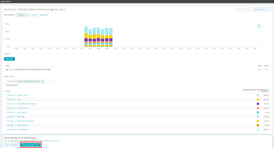
Choose chart from the dashboard / Go to custom chart,
Choose "preview upgraded chart"
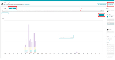
after that
- choose code tag
- change the number of requests in brackets => limit(10)
- click run query
- pin your custom chart to the selected dashboard
Featured Posts


