- Dynatrace Community
- Ask
- Dashboarding
- Re: New dashboards (1.192.96) ?
- Subscribe to RSS Feed
- Mark Topic as New
- Mark Topic as Read
- Pin this Topic for Current User
- Printer Friendly Page
- Mark as New
- Subscribe to RSS Feed
- Permalink
15 May 2020 01:45 PM
Hi,
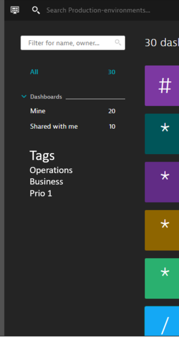
generally I like new dashboarding features - but not so much design of "Dashboards overview" page (especially white color).
Please try to keep old look & feel in Dashboard overview page -> black color and more tiles in the page - and maybe move some of actions to separate "config" page(s).
Proposal
- add list of dashboard tags to main page
- add selected values to permalink (/dashboards?gtf=l_180_MINUTES&gf=all&tag=Operations&Favorite=Yes)

Solved! Go to Solution.
- Labels:
-
dashboards classic
- Mark as New
- Subscribe to RSS Feed
- Permalink
15 May 2020 01:47 PM
A new update that you should be getting very soon will provide you with a new design of the Dashboard section.
Since you referenced the white on the page, you might have already seen this new update. I would recommend putting in a RFE for the developers to take into account your feedback.
- Mark as New
- Subscribe to RSS Feed
- Permalink
19 May 2020 11:38 AM
BTW - I see the old layout is still accessible -> via /#dashboards;gf=all 🙂
- Mark as New
- Subscribe to RSS Feed
- Permalink
19 May 2020 01:07 PM
Good to know! thanks for the insight!
Featured Posts
