- Dynatrace Community
- Ask
- Dashboarding
- Peak Hour Dashboard
- Subscribe to RSS Feed
- Mark Topic as New
- Mark Topic as Read
- Pin this Topic for Current User
- Printer Friendly Page
- Mark as New
- Subscribe to RSS Feed
- Permalink
25 Feb 2021 06:01 PM
Can I get the peak hour per day, peak day per week and month for a service on the Dynatrace dashboard
Solved! Go to Solution.
- Labels:
-
dashboards classic
- Mark as New
- Subscribe to RSS Feed
- Permalink
04 Mar 2021 10:26 PM
Hi aparna_raman
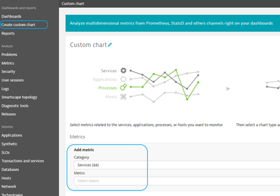
You can utilize the Custom Charts and add the metric/s you'd be interested in. Once added to the current or new dashboard, you can edit the tile to show specific time frame or the way the data looks (timeseries, pie...etc.).
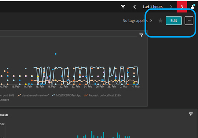
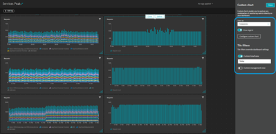
Once added to the current or new dashboard, you can edit the tile to show specific time frame or the way the data looks.
Here is an example for all "busy" services compared to one service, showing hour per day, week and month peaks.
You can find more information on creating custom dashboards here https://www.dynatrace.com/support/help/shortlink/charts-create or by visiting the Dynatrace University https://university.dynatrace.com/ondemand/course/21819.
Regards,
Moe
- Mark as New
- Subscribe to RSS Feed
- Permalink
05 Mar 2021 11:03 AM - edited 05 Mar 2021 11:05 AM
Hi,
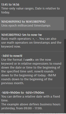
I am using dashboards showing response times and error rates for peak hours (9:00-12:00) in every day of pevious week. The timeframe definition look then this way :
- 8 days back -> "-8d/d+9h to -8d/d+12h"
- 7 days back -> "-7d/d+9h to -7d/d+12h" etc...
Main use case is then - users are subscribing for this dashboard weekly.
See timeselector help
BR, Josef
Featured Posts


