This website uses Cookies. Click Accept to agree to our website's cookie use as described in our Privacy Policy. Click Preferences to customize your cookie settings.
Dashboarding
Dynatrace dashboards, notebooks, and data explorer explained.
Turn on suggestions
Auto-suggest helps you quickly narrow down your search results by suggesting possible matches as you type.
- Dynatrace Community
- Ask
- Dashboarding
- Re: visualize custom metric with Honeycomb
Options
- Subscribe to RSS Feed
- Mark Topic as New
- Mark Topic as Read
- Pin this Topic for Current User
- Printer Friendly Page
Options
- Mark as New
- Subscribe to RSS Feed
- Permalink
13 Mar 2025
08:25 AM
- last edited on
13 May 2025
08:14 AM
by
![]() Michal_Gebacki
Michal_Gebacki
Hi,
I have a custom metric (I am ingesting data points using the metrics API) which contains attributes such as: id, status, substatus, etc.
I am trying to visualize the data points of this metric with honeycomb. I am trying to plot all the ids with the specification:
- green: if status == "ok"
- yellow: if status == "warning" and substatus == "retry"
- red: if status == "failed" and substatus == "error"
The status and substatus are just dummy examples.
Is there a way to achieve this scenario with my metrics? I tried looking into calculated metrics, but I saw that it works only on the metrics ingested via OneAgent. Thus, I am stuck.
I appreciate any help on this 🙂
Solved! Go to Solution.
Labels:
- Labels:
-
dashboards classic
-
metrics
honeycomb-example.png
136 KB
8 REPLIES 8
Options
- Mark as New
- Subscribe to RSS Feed
- Permalink
13 Mar 2025 11:34 AM
Hi @KushalG, Hope you are doing well, If you are looking for the solution for Calculated service metrics, then yes we can do this.

If the ask is different please post it. lets see the other workaround.
Thanks
aravind
Options
- Mark as New
- Subscribe to RSS Feed
- Permalink
13 Mar 2025 03:57 PM
Hi @AravindhanV , thanks for your answer.
Is it possible to derive a calculated metric out of my custom metric?
As I had explained earlier, I have fine grained data points for every task, and I want to derive a calculated metric based on my specifications, such as (e.g.):
id=<id1>, state = 0 ( because status == 'ok')
id=<id2>, state=1 (because status == "warning" and substatus == "retry")
id=<id3>, state=1 (because status == "warning" and substatus == "paused")
id=<id4>, state=2 (because status == "error" and substatus == "failed")
if this can be achieved, I can plot this calculated/derived metric and color code my tasks accordingly.
Regards,
Kushal.
Options
- Mark as New
- Subscribe to RSS Feed
- Permalink
13 Mar 2025 11:50 AM
So with thresholds you will be stuck with using a numeric. Which means you cant call out Green = "Okay" Green would have to equal a Number. This goes for the other colors, here is an example using your design that closely aligns with Pod Phases:

What we did for Pod Phases was use a Pie chart:

This allows us to call out the Phase which isn't a numeric value, and assign it a color.
I hope this helps 🙂
-Chad
Reply
Options
- Mark as New
- Subscribe to RSS Feed
- Permalink
13 Mar 2025 03:51 PM
Hi Chad,
thanks for your answer. Initially, I did use a pie chart to display this information. But, in our case, we wanted to have an overview of all the tasks (identified by id) and not groups. And that's where things got tricky.
I wanted to plot it like this:

Do you know if there's any solution to this?
Regards,
Kushal.
Options
- Mark as New
- Subscribe to RSS Feed
- Permalink
13 Mar 2025 04:12 PM
So I dont think you will get them into one Honeycomb overall. You might need to do a group in each tile. Split by Task ID, then filter on all tasks that have a status "OK" as green, Then make another tile that does the same thing but filters on the next task result and you can add in the desired color. The issue is the status isnt a number, If it was 1 as good, 2 as warning, 3 as bad then yes you could use a single honeycomb.
-Chad
Options
- Mark as New
- Subscribe to RSS Feed
- Permalink
17 Mar 2025 01:08 PM
Hi Chad,
I ran across multiple issues.
1. I was using a custom metric, and looks like my ingested data reached the limit Extend metric observability — Dynatrace Docs
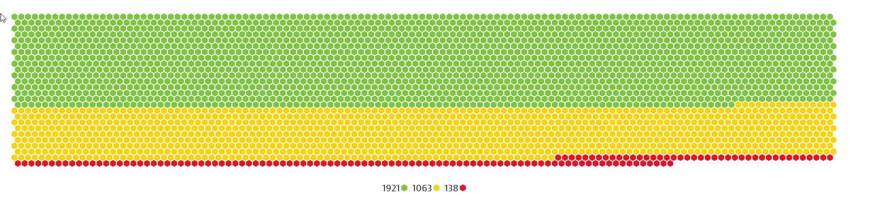
2. After reaching that limit, all my new data points were rejected (around 1.06M records were rejected by Dynatrace)
Overall, my metric design looks inefficient, and I might be logging too much info in Dynatrace and Dynatrace is unable to handle it.
Thus, I decided to compute the status of my tasks from the client (which ingests the metric to Dynatrace) rather than letting Dynatrace handle that, and annotate it as 1,2,3,4,5, etc.
What's confusing me is, how do I color code different hexagons based on their status? Is that possible?

In this example, I am splitting by ID, and setting the value to "Auto".
Thanks,
Kushal.
Options
- Mark as New
- Subscribe to RSS Feed
- Permalink
17 Mar 2025 01:36 PM
So you can only have 3 colors as it relates to the threshold. So your overall design - what do you want the Colors to be? Keep in mind, you can do ranges as well. For Example:
Green "OK" = 1
Yellow "WARNING" = 3
Red "FAILED" = 5
OR RANGES:
Green "OK" = 1-2
Yellow "WARNING" = 3-4
Red "FAILED" = 5-Above
Here is an example of using CPU and the value of CPU being segment that uses the defined color threshold. So if you have build your metric to provide a value of 1 for Good, then put in 1 being green, then 2 for warning, put that as yellow and 3 or 4 for Red, put in 3.

I hope this helps.
-Chad
Reply
Options
- Mark as New
- Subscribe to RSS Feed
- Permalink
17 Mar 2025 02:38 PM
Thanks Chad!
it's quite weird that we only have 3 colors. I guess I can live with that for now. 🙂
I also realized that I was ingesting my data in the wrong way. I fixed that and it works. I need to learn "how NOT to create a bloated metric" 😀
many thanks for your help.
Regards,
Kushal.
Featured Posts
