- Dynatrace Community
- Ask
- Open Q&A
- Re: Latest Dynatrace - Early Feedback
- Subscribe to RSS Feed
- Mark Topic as New
- Mark Topic as Read
- Pin this Topic for Current User
- Printer Friendly Page
- Mark as New
- Subscribe to RSS Feed
- Permalink
05 May 2023
02:20 PM
- last edited on
25 May 2023
02:47 PM
by
![]() MaciejNeumann
MaciejNeumann
Dear Community, I'm interested in your feedback as well. The moment latest Dynatrace was released to our tenant I got calls of uncertain excitement from my users. I told them it was safe to turn it on and it's simple to toggle back and forth incase things don't work out. This is an early release so look around, let me know how it goes, but improvements are coming.
I received some positive comments regarding the new look and feel. A complaint of the way legacy pages were not converted yet, making for a SolarWinds APM like inconsistent UI feel.
Within 60 minutes though I started getting emails and Teams messages complaining of how difficult it was to access their metrics with the new dashboards and notebooks. "It looks pretty, but I spent 2 hours unsuccessfully trying to recreate charts I already have in my classic dashboards", "It's too difficult to find metrics in the new structure", "There are not enough examples to guide us", "There should be an in place linter to help fix queries", "Where is the Data Explorer for Grails?", "I am finding it difficult to access my metrics with this code. Where is the visual graph building like Data Explorer".
I've instructed them that it's nice that we are able to experience latest Dynatrace so early, we'll send the feedback to Dynatrace, and lets hope improvements arrive soon.
I would though like to hear how other Community Members are doing. Maybe those Early Adopters could tell us they had similar initial reactions but it got better.
Solved! Go to Solution.
- Labels:
-
latest dynatrace
- Mark as New
- Subscribe to RSS Feed
- Permalink
07 May 2023 02:52 PM
One of the first problems I noticed was with basic functionality. There is no way that I can find with the new interface to switch between environments.
Links to the community from the new interface result in an error.
- Mark as New
- Subscribe to RSS Feed
- Permalink
07 May 2023 04:14 PM
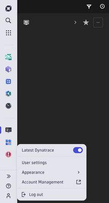
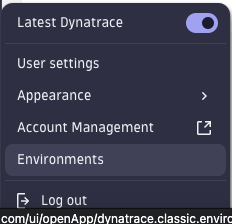
It took me a bit to find it but its hidden behind the profile icon on the bottom left of the page.
its that "latest dynatrace" toggle.
- Mark as New
- Subscribe to RSS Feed
- Permalink
07 May 2023
05:19 PM
- last edited on
25 May 2023
02:49 PM
by
![]() MaciejNeumann
MaciejNeumann
Sorry I should have been more clear. I did find how to turn off the latest Dynatrace interface. In the new interface there is no way to switch between multiple Dynatrace tenants. Either need to bookmark the urls or switch to the old interface to find all of our tenants.
- Mark as New
- Subscribe to RSS Feed
- Permalink
09 Jun 2023 05:46 PM
As a partner supporting multiple dynatrace customers with sometimes more environments, we are a heavy user of the switch function. So it's often back to the old UI too until Q3 for this function.
- Mark as New
- Subscribe to RSS Feed
- Permalink
08 May 2023 11:33 AM
Hi Mike! The "environment switcher" is planned to be available in the third calendar quarter. Our current concept includes indicating the current environment in the user menu, filtering for all environments users have access to, favoriting of environments to have them show up on top and allowing to switch environments quickly through the search (e.g. CMD/CTRL+K > search for environment > ENTER to open environment)
- Mark as New
- Subscribe to RSS Feed
- Permalink
08 May 2023 01:25 PM
Thanks -- this makes sense and I'm glad that it is planned, but it does seem like this is a blocker for some of my organization to easily use the new interface and switch between environments. Will Dynatrace hold off on making this the default interface until this change is made?
- Mark as New
- Subscribe to RSS Feed
- Permalink
08 Jun 2023 08:45 PM
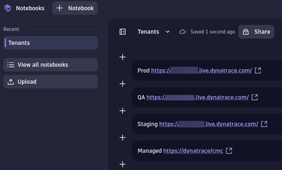
While we wait you can create a new notebook and put the links on it:
- Mark as New
- Subscribe to RSS Feed
- Permalink
07 May 2023 04:18 PM
Did not find a way to switch between environments ![]()
- Mark as New
- Subscribe to RSS Feed
- Permalink
07 May 2023
04:31 PM
- last edited on
25 May 2023
02:47 PM
by
![]() MaciejNeumann
MaciejNeumann
Amm, yep not straightforward to get use to this latest Dynatrace look and feel 🤔
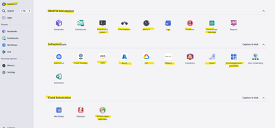
But just look on this as a menu change from the old vertical menu to a new spread on all over the page menu
You still able to get to all the "old" entries from the Dynatrace upper left entry
HTH
Yos
- Mark as New
- Subscribe to RSS Feed
- Permalink
08 May 2023 11:42 AM - edited 08 May 2023 11:43 AM
Hi Yos! The general look and feel certainly changes. While that is by design, we're aware that it will take a while to get used to. Just a couple of tips:
- The main landing page (accessible through the "Dynatrace" entry) is not actually a menu, but an early version of a fully customizable home screen. Think of it like the desktop on Windows / OSX. It just happens to look like a menu at the moment, because we pre-populated it for everyone accustom to the previously overcrowded left-hand product menu.
- The new left-hand menu is the place where the latest Dynatrace already allows for quite some customization. It allows to pin / order your most important apps and will also show all other recently used ones for you to quickly get back to. We pre-populated it with the list of "favorites" from the previous left-hand menu.
PS: Please keep us posted about your early impressions! We'll help to sort out any issues you might face.
- Mark as New
- Subscribe to RSS Feed
- Permalink
09 May 2023 06:28 AM - edited 10 May 2023 09:09 AM
Hi @RomanW
Since we deal with few SaaS environments, the name of the environment at the top search old UI is missing in the new UI
Without this search currently we don't know to which environment we are logged to 🤔
Old UI:
Thanks
Yos
- Mark as New
- Subscribe to RSS Feed
- Permalink
12 May 2023 09:15 AM - edited 12 May 2023 09:41 AM
I seem to have to missed the boat on this one, and I can nowhere find an introduction to it (only for the now classic? release). Where can I find the announcement of the new dashboarding and the changes/advantages it entails? Pointer to a release note perhaps?
I see the documentation is already updated.
Update: OK, so actually interpreting the (Saas) release notes of 1.265, where it is introduced as 'the new Dynatrace'. Dynatrace SaaS release notes version 1.265 | Dynatrace Docs
- Mark as New
- Subscribe to RSS Feed
- Permalink
14 May 2023 05:38 PM
It might take a while until you get your environment(s) converted.
- Mark as New
- Subscribe to RSS Feed
- Permalink
14 May 2023 05:59 PM
Being a "power user" I really find the DQL and "all things grail" extremely powerful, but I have two doubts about adoption:
- I don't think regular users will be able to use DQL for accessing data without any in-product guidance (wizard helping you build your query) or intensive training. Mainly just for creating a simple dashboard from metrics or logs.
- FinOps - since you are charged for every DQL query, I find it impossible to plan the licenses even for a short term. Having the license costs under control will be significantly more challenging than before.
- Mark as New
- Subscribe to RSS Feed
- Permalink
14 May 2023 07:57 PM
The FinOps / DQL licensing is a great challenge. I see so many risks, that driving adoption will not be an easy task...
- Mark as New
- Subscribe to RSS Feed
- Permalink
30 May 2023 07:56 PM
I completely agree. I understand the concept and vision but keeping costs under control is going to be difficult and will likely hold back adoption in our environment.
- Mark as New
- Subscribe to RSS Feed
- Permalink
23 May 2023 08:32 PM
A comment on the wizard/guided approach as it relates to the cost comments.
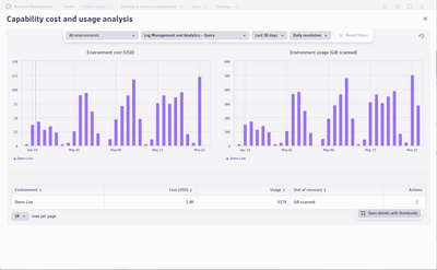
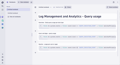
- Usage and cost of Grail-related capabilities are shown in the Account Management portal with a drill-down to a prepopulated notebook to provide insights into query usage and the user/app running them.
($/usage values are for demo purposes only)
- We are also working on features to detect and notify you when higher-than-expected usage is detected on a capability. While this may not directly address the planning aspect of your post, it can help keep costs under control.
- Mark as New
- Subscribe to RSS Feed
- Permalink
24 May 2023 07:42 AM
Good to know this is at least already addressed at least to some degree. With broader usage more FinOps problems start to appear.
@mark_eshelby with Log management / Business events it's clear how the billing works - what about upcoming Metrics on Grail / Traces on Grail?
- Mark as New
- Subscribe to RSS Feed
- Permalink
09 Jun 2023 05:57 PM
I think I saw already somewhere another post, but the Problems and Security counters in the top bar, I miss them too.
You can put the Problem app on the sidebar, but we're missing the counter/indicator.
RFE: Bring back the live count of problems on the "Problems" app icon in the new Navigation panel - ...
- Mark as New
- Subscribe to RSS Feed
- Permalink
30 Jun 2023 07:54 AM
I really miss links to API swagger pages, cannot understand why they are gone in latest ui...
- Mark as New
- Subscribe to RSS Feed
- Permalink
24 Sep 2023 11:59 AM
Yeah, I know this new look is still in heavy development, but holy smokes, there is so much that is missing to make this an even close to reasonable replacement for the old look... Just simple stuff like switching the environment and clicking to the API (as you pointed out) are missing completely... Not to mention that I really liked having the search box be at the top rather than a clickable link. Even though it's the same number of clicks, it just felt way better having the search bar at the top of every page... Not to mention that the results that the old search provided seems far superior to what I'm getting in the new one.
- Mark as New
- Subscribe to RSS Feed
- Permalink
18 Jul 2023 01:30 AM
I remember a Dynatrace presentation back in the day 'Dynatrace for AppMon users'.
Today was my first experience with the new UI - is there anything like a 'The new Dynatrace UI for Classic UI users' guide available?
I predict a big shock for my user base once this eventually gets to us.
- Mark as New
- Subscribe to RSS Feed
- Permalink
21 Aug 2023 02:21 PM
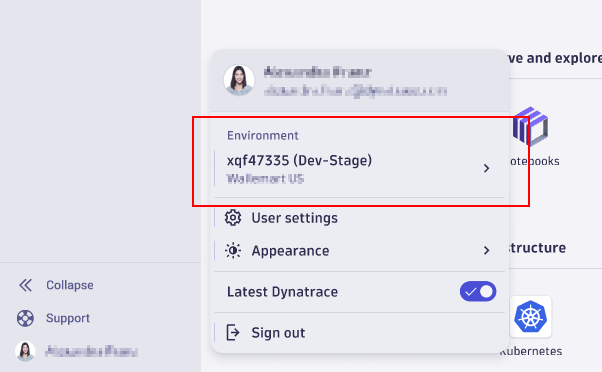
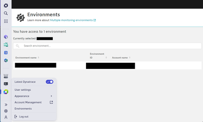
You can now switch between environments :
- Mark as New
- Subscribe to RSS Feed
- Permalink
21 Aug 2023 02:32 PM
This is helpful, but it would be nice if it included a context menu with the different environments like the old UI has today which is what @RomanW's screenshot above appeared to show. In some cases like this one, the new UI tweaks involve more page loads and clicking around then the old UI which is less than ideal.
- Mark as New
- Subscribe to RSS Feed
- Permalink
26 Sep 2023 01:53 PM
Hi community members,
I would like to update you on a few topics mentioned in this thread.
- The Environment switch will be introduced soon and is available for you in CQ4. You can then see your environments if you have access to more than 1 in the user menu and will be on click redirected to the particular one. We will also indicate in which environment a user currently is in.
- Finding and charting metrics will become much easier with the introduction of our query builder. Accessing data will therefore be much easier for non-power-users and user who are not yet familiar with our DQL. You can expect a first version of this in CQ4 as well.
- Some were concerned about having the license costs under control. Assigning Dynatrace costs to teams and adding transparency to teams is a key investment area of licensing in upcoming calendar year 2024. This improvements are going to be supported with our newest subscription model “Dynatrace Platform Subscription”.
- There won’t be a problem indicator integrated into the new UI version anytime soon. However, we’re working on customizable “home” or “launch” pages so that users can set them up individually for their needs. One option for this is to integrate the open problems count and/or system notifications.
- Mark as New
- Subscribe to RSS Feed
- Permalink
03 Oct 2023 02:34 PM
We definitely need to have the open problems counter put back the way it was. I'm not sure why that functionality was removed in the first place. It's great to see that no matter where you are in the tenant to keep track of how many open problems we have.
- Mark as New
- Subscribe to RSS Feed
- Permalink
05 Dec 2023 12:45 AM
Hello Ursula, thanks for that response.
In order to clarify point number one, when will that be fully in effect? I see now that there is an environment switch, but in order to see the environment name / ID I need to actually click into a new window instead of just showing when hovering over / as soon as you expand the account window. Will we be able to see the environment without having to click to the page where we can switch them?
Thanks!
- Mark as New
- Subscribe to RSS Feed
- Permalink
03 Oct 2023 02:29 PM
Has anyone been talking about the new global search feature? I find it doesn't accurately search through all my entities the way the "classic" global search did. It's fairly unusable at this current time. For example, when searching for a simple host by name I will often see the message "no entities found". In the "classic" global search I was able to paste in IP addresses and it would link me to the host it belonged to. It seems the new search feature is not actually searching through the entire tenant the way the "classic" search did, and also doesn't include related links to documentation. Can we at least get the same global searching features that we're used to?
- Mark as New
- Subscribe to RSS Feed
- Permalink
23 Oct 2023 08:46 PM
I would like to emphasize on this issue too!
My client is facing the same concern and this is a road block for them to move onto the Platform and new UI.
- Mark as New
- Subscribe to RSS Feed
- Permalink
27 Oct 2023 10:27 AM
Hi @StrangerThing – could you please provide more details regarding the expected host not showing up? We're rolling out an update that means the new UI will be searching across the same timeframe as the "classic" UI – up till recently this was a reduced timeframe, which may have been what was causing the lack of result. If this issue persists, please open a support ticket and we can investigate the issue on our side.
With regards to links to documentation – please keep an eye on the Davis CoPilot announcements, since we'll be addressing this indirectly.
- Mark as New
- Subscribe to RSS Feed
- Permalink
30 Oct 2023 01:52 PM
For instance, I know I have hosts with the string "web" in the host name. On the classic Dynatrace, I can simply search the string "web" in the global search and I will get all kinds of results, including the hosts that contain that string in the name. In the new search, if I search the string "web" in a tenant where I know I have active hosts with that string in the name, I don't get any host results.
I'd like to point out that this isn't just for hosts, but in general, the new search doesn't appear to be searching nearly as thorough as the classic search did. Very disappointing.
- Mark as New
- Subscribe to RSS Feed
- Permalink
01 Nov 2023 05:56 PM
Completely agree that the new search is disappointing and not meeting our needs.
- Mark as New
- Subscribe to RSS Feed
- Permalink
03 Oct 2023 02:41 PM
The new dashboards need to be discussed as well. While it's great to be able to use DQL to drive the tiles, the look and feel of the new tiles is not that great. I would particularly like if they had a more similar look and feel as the old tiles, but driven by DQL instead of Data Explorer. It seems the scaling of the legend in each tile is nonexistent. The legend text appears to stay the same size no matter the size of the tile. We're used to having lots of tiles and data on each dashboard but this limits that capability. We have large screens in our NOC that display our very detailed classic dashboards and our executives are very happy with them. They can easily see all the important metrics around our services/infrastructure at-a-glance.
- Mark as New
- Subscribe to RSS Feed
- Permalink
30 Oct 2023 02:01 PM
I am also concerned that in "V2" we do not have a cost associated to dashboards with metrics/data explorer. I'm concerned about future costs if all dashboards are DQL based. We run a lot of dashboards 24x7 in our command center as well.
- Mark as New
- Subscribe to RSS Feed
- Permalink
02 Nov 2023 02:32 PM
I've asked this question as well and have been told to create metrics to track anything that will be commonly queried. Metrics are going to have to be audited with this new model so we don't have overlapping metrics.
- Mark as New
- Subscribe to RSS Feed
- Permalink
02 Nov 2023 02:58 PM
I've heard something similar, but it is unclear to me if there will be a cost associated to querying metrics.
- Mark as New
- Subscribe to RSS Feed
- Permalink
07 Nov 2023 01:43 PM
My understanding is that you can query metrics as much as you want, which is why they're good for dashboards, etc. I'll let someone from Dynatrace give the official answer.
- Mark as New
- Subscribe to RSS Feed
- Permalink
03 Oct 2023 06:57 PM
One of the things I'm interested in is being able to search directly to particular settings from the search bar. For example, we can go directly to the "request attributes" page in the old tenant by searching for it, but in the new one there is not quite that same level of direct access.
- Mark as New
- Subscribe to RSS Feed
- Permalink
23 Oct 2023 08:47 PM
Likewise here!
Would love to see an update about this issue.
- Mark as New
- Subscribe to RSS Feed
- Permalink
27 Oct 2023 07:06 PM
Yes I just recently saw that when I tried again, thanks for adding!
- Mark as New
- Subscribe to RSS Feed
- Permalink
05 Oct 2023 03:18 PM - edited 05 Oct 2023 03:19 PM
New left nav panel:
I like the idea of going back to my recent page, however I think this functionality should be reversed. It would work better if, when clicking on the app in the left nav, it did the "relaunch" feature. If I want to go to a recent page, that should be what pops up when I hover over the left nav app. Maybe even store the most recent two or three pages for each app? There also seems to be some apps that don't have a relaunch feature, which has caused me to get stuck in an app before where I had to refresh the entire page to effectively relaunch the app.
- Mark as New
- Subscribe to RSS Feed
- Permalink
08 Nov 2023 01:55 PM
Can we get the "publish as preset" feature added to the new dashboards? Without it, we have to create a new group that contains all the SAML claims just to share dashboards to everyone. See related post: Re: New Dashboards Equivalent to Publish as Preset - Dynatrace Community. I'm not sure why this feature would be removed from dashboard sharing in the first place.
Featured Posts
