- Dynatrace Community
- Community
- Community challenges
- Re: Take the Data Explorer Challenge! 📊
- Subscribe to RSS Feed
- Mark Topic as New
- Mark Topic as Read
- Pin this Topic for Current User
- Bookmark
- Follow
- Mute
- Printer Friendly Page
Take the Data Explorer Challenge! 📊
- Mark as New
- Bookmark
- Follow
- Mute
- Subscribe to RSS Feed
- Permalink
14 Sep 2022
12:53 PM
- last edited on
21 Sep 2022
02:31 PM
by
![]() zietho
zietho

Following the inspiration from our unstoppable Dynatracer @zietho, we'd love you to show the fanciest explorer tile-based dashboards, your coolest and most insightful metric expressions, or simply beautiful visualizations you're proud of! Share it any way you prefer, so other members could easily check it out.
As always, we've prepared exciting rewards for everyone who'll submit their unique answers down below. You'll get a unique "Data Explorer" badge, 100 bonus points, and who knows... Maybe you'll learn something exciting from other participants 😉
- Labels:
-
community challenge
- Mark as New
- Bookmark
- Follow
- Mute
- Subscribe to RSS Feed
- Permalink
14 Sep 2022 02:56 PM
That's a good challenge, will watch it to steal ideas, 🤣.
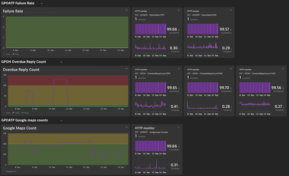
Mine is not fancy, nor complex queries... the beauty here is that my client was looking for a way to monitor their http requests result done thru a Synthetic Monitor. They know that we can do calculations in post execution scripts in the Synthetics, but we can not store values to compare in the following executions.
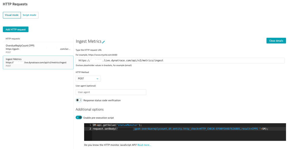
So the idea I had was to add a new event to their Synthetics, this time, calling the Dynatrace Metric ingestion API, so we can have the results history and watch them in a Dashboard and even do metric events monitoring over it.
I am using the Synthetic entity as dimension to the custom metric, so I can attach the alerts generated to the client MZ. The SM variable there in the script is collected parsing a json, in the previous event, the one client is using to test their app.
So we have two monitoring in one. The app availability tested by Synthetic, and the data value monitoring, with history, done by the custom metric injection.
I guess it does fit in this challenge.
- Mark as New
- Bookmark
- Follow
- Mute
- Subscribe to RSS Feed
- Permalink
04 Oct 2022 02:07 PM
Thank you @dannemca!
And about "stealing ideas" - one of my friends who conducts training, always says at the beginning to the attendees:
"If you will find something really valuable today - you can "steal it" and pass it on. As long as you share your knowledge with good intentions - it's not a crime. 😉 And if you add my name to it, I'll be glad. 😀"
- Mark as New
- Bookmark
- Follow
- Mute
- Subscribe to RSS Feed
- Permalink
13 Oct 2022 04:57 PM
Yes I remember some from the Synthetic folks to also use a monitor to ingest data in Dynatrace internally really nice and funny way of automating gathering and storing data 🙂
- Mark as New
- Bookmark
- Follow
- Mute
- Subscribe to RSS Feed
- Permalink
15 Sep 2022 02:59 PM
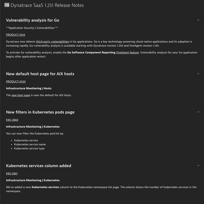
Maybe it's not the most breathtaking visualization, but an attempt to discover a new use case for Dynatrace dashboards. Here in the Dynatrace Doc team, we're experimenting with the Dashboards and Extensions 2.0 framework to add the release notes to the product in a way that it's detached from the cluster code. A very basic extension with a dashboard JSON as an asset does the job. This approach would allow us to ship the release notes when the version is released. We're thinking about the automation that would build the extension based on the same source from which the online release notes are cgenerated. And here's a mock. One of the great things about it is the ability to link directly to places in the Dynatrace UI.
- Mark as New
- Bookmark
- Follow
- Mute
- Subscribe to RSS Feed
- Permalink
16 Sep 2022 12:45 PM
Love this idea. And add anything that aren't in release notes?
- Mark as New
- Bookmark
- Follow
- Mute
- Subscribe to RSS Feed
- Permalink
05 Oct 2022 06:05 PM
@Kenny_Gillette what do you mean by "And add anything that aren't in release notes?" Our goal is to transparently communicate all the changes. If in the end, the release notes make it to the product, the content scope should be the same, but with the advantage of following the direct links, rather than reading "Go to Settings > Feature > Settings" menu cascades. Let me know what you think 🙂
- Mark as New
- Bookmark
- Follow
- Mute
- Subscribe to RSS Feed
- Permalink
20 Oct 2022 02:04 PM
There are items that are released that don't make release notes. Or they don't make in release notes right at first. Perfect example - data explorer (templates) was not in the release notes on day 1. It was added later. I have also had discussions with people at Dynatrace that even told me not everything makes in release notes. Hope this helps.
- Mark as New
- Bookmark
- Follow
- Mute
- Subscribe to RSS Feed
- Permalink
04 Oct 2022 02:10 PM
Thank you @jaroslaw_orlows!
Any automation that simplifies the work is desirable, but having this one would be great. Fingers crossed for this experiment. 🤞
- Mark as New
- Bookmark
- Follow
- Mute
- Subscribe to RSS Feed
- Permalink
15 Sep 2022 09:27 PM
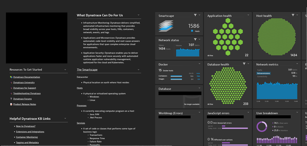
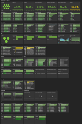
Challenge accepted! :). I am working with a customer who's utilizing the dashboarding capabilities nicely. A mix between custom and predefined tiles to customize their landing page. A holistic view of the environment while addressing the most common questions.
- Mark as New
- Bookmark
- Follow
- Mute
- Subscribe to RSS Feed
- Permalink
26 Sep 2022 11:58 AM
Honeycombs! 🐝🐝🐝
- Mark as New
- Bookmark
- Follow
- Mute
- Subscribe to RSS Feed
- Permalink
04 Oct 2022 02:16 PM
Thank you @Mo_Azuz for sharing that.
The most important pieces of information served on one plate look great! 👌
- Mark as New
- Bookmark
- Follow
- Mute
- Subscribe to RSS Feed
- Permalink
15 Sep 2022 10:22 PM
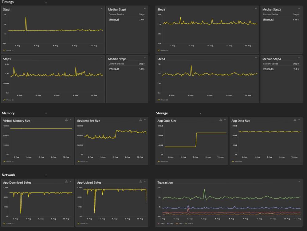
I'll point to "cool" metrics. In this case it's about a synthetic monitoring made on real mobile phones, in this case an iPhone 6S. It's a 4-step transaction, with timing data and additional metrics grabbed from the phone:
- Mark as New
- Bookmark
- Follow
- Mute
- Subscribe to RSS Feed
- Permalink
28 Sep 2022 09:00 AM
Looks so clean, perfect order! 😀
- Mark as New
- Bookmark
- Follow
- Mute
- Subscribe to RSS Feed
- Permalink
04 Oct 2022 02:28 PM - edited 04 Oct 2022 02:30 PM
When I'm looking at these graphs I have one association...
...with the lifeline:
Dr @AntonioSousa 😉 👨⚕️ , please don't stop to take care of the health of the infrastructure and data!
- Mark as New
- Bookmark
- Follow
- Mute
- Subscribe to RSS Feed
- Permalink
04 Oct 2022 02:38 PM
Those mobile phones are more like kids... Sometimes they misbehave, and we feel like we are baby-sitting them 🤣🤣🤣
- Mark as New
- Bookmark
- Follow
- Mute
- Subscribe to RSS Feed
- Permalink
04 Oct 2022 02:47 PM
😂🤣😂🤣
- Mark as New
- Bookmark
- Follow
- Mute
- Subscribe to RSS Feed
- Permalink
13 Oct 2022 02:25 PM - edited 13 Oct 2022 02:25 PM
mobile 📱 first ❤️!!!! Neat and tidy!
- Mark as New
- Bookmark
- Follow
- Mute
- Subscribe to RSS Feed
- Permalink
16 Sep 2022 01:35 PM
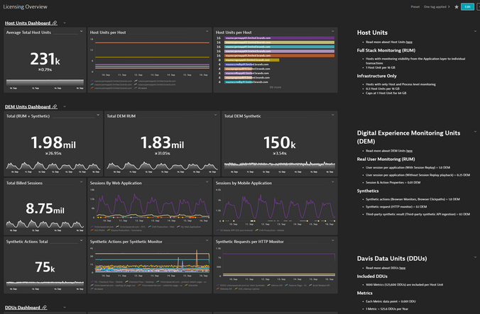
Not something new but for my customer I have been using the licensing dashboard that is capturing the data using the license extension. The dashboard comes from a template that already existed. This dashboard groups up the DDUs, Synthetic, RUM, DEM etc all in one chart
- Mark as New
- Bookmark
- Follow
- Mute
- Subscribe to RSS Feed
- Permalink
04 Oct 2022 02:32 PM
Looks great @jarinmusarrat!
Thanks for sharing! ![]()
- Mark as New
- Bookmark
- Follow
- Mute
- Subscribe to RSS Feed
- Permalink
21 Sep 2022 01:34 PM - edited 21 Sep 2022 03:00 PM
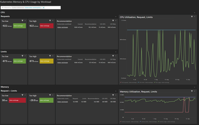
The "Kubernetes Memory & CPU Usage by Workload" dashboard helped us in our k8s cluster to find the right limit/requests for cpu and memory for our workloads. Its interactive and let you filter for your k8s deployment. By default it shows the top 10 wasteful deployments to use our resources wisely.
- Mark as New
- Bookmark
- Follow
- Mute
- Subscribe to RSS Feed
- Permalink
13 Oct 2022 02:12 PM
@florian_g fyi
- Mark as New
- Bookmark
- Follow
- Mute
- Subscribe to RSS Feed
- Permalink
21 Sep 2022 02:12 PM
I want to talk in this one regarding the transformations that become available on Data Explorer, and, specially, for my favorite one that is the parents Transformation.
It solved several use cases where the Key Request needs to be in context in the visualization with the entity they belong to (among other use cases!). This Transformation provides just that, so is really a handy one!
- Mark as New
- Bookmark
- Follow
- Mute
- Subscribe to RSS Feed
- Permalink
27 Sep 2022 07:59 PM
Great Post!!!. Agree @arturo_mondelo transformations are very handy, please share an snapshot. 🖼
- Mark as New
- Bookmark
- Follow
- Mute
- Subscribe to RSS Feed
- Permalink
22 Sep 2022 09:15 AM
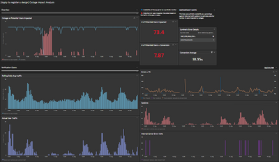
I´d been working on a dashboard to show the impact an outage might have on real users.
This dashboard calculates an average of the traffic for the past four weeks, and, if there is an outage, it makes the math to estimate how many users might be impacted and how many might not convert because of it. We can even calculate a loss of revenue depending on if we have the avg cart value.
I also added visualizations like Errors, Visually Complete, Error page, and real traffic to identify if the outage might be related to any of these causes or if we can see a drop in real traffic.
This is a sensitive dashboard; it is essential to have a synthetic monitor that represents the conversion journey very well and has to be very well maintained. And is very important to communicate to the client that this can only estimate an impact on real users.
I think it is an excellent way of showing clients who rely on our synthetics to measure their applications' availability and the impact that the outages might have.
It is not the same to have an outage during the night, when there is no traffic than having it at the time of the day when there is more traffic.
Availability as a metric is calculated by time, and this can complement to understand the impact of an outage.
- Mark as New
- Bookmark
- Follow
- Mute
- Subscribe to RSS Feed
- Permalink
27 Sep 2022 05:35 PM
I want to do something like this too. Thanks for idea
- Mark as New
- Bookmark
- Follow
- Mute
- Subscribe to RSS Feed
- Permalink
28 Sep 2022 07:40 AM
Hi!! Feel free to contact me if you have any doubts 🙂
- Mark as New
- Bookmark
- Follow
- Mute
- Subscribe to RSS Feed
- Permalink
22 Sep 2022 10:23 AM
This is a journey dashboard created for a customer to showcase the health of multiple components in an application & overview of transaction from Source -> Middleware -> Actual App (and its components) -> Backend.
Couldn't capture the whole dashboard in one snap, hence above snap is a part of the whole :):)
- Mark as New
- Bookmark
- Follow
- Mute
- Subscribe to RSS Feed
- Permalink
06 Oct 2022 08:30 AM
@DarshanaR as soon as I looked at your dashboard, I immediately thought about TETRIS 😀
- Mark as New
- Bookmark
- Follow
- Mute
- Subscribe to RSS Feed
- Permalink
13 Oct 2022 02:06 PM
this is crazy! incredible what people do with limited means :).
I am impressed!
- Mark as New
- Bookmark
- Follow
- Mute
- Subscribe to RSS Feed
- Permalink
22 Sep 2022 01:59 PM
This is a hard challenge as I have so many sweet dashboards.
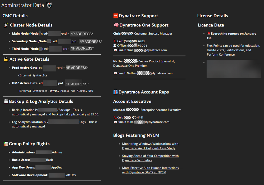
First, our Dynatrace Admin page. This page elaborates all the details an Admin would need. Granted, its more of a Markdown Page, but still its been a huge benefit for our Admin Team:
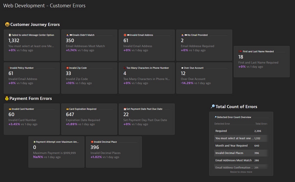
Lastly, our customer journey page which provides valuable information as to what Issues/bugs/errors that our paying customers run into. This provides the web development team with insight into their design and how it functions with the average customer. For example, we once reviewed a session replay where a user spent 30 mins paying his bill, he reapplied his card payment details, billing address and everything, the issue was they forgot to supply their phone number which was a required field, but there was no popup directing them to that page. Ultimately, the user finally scrolled up high enough to see that the phone number was missing, which posed the question.... is a phone number really required for payment? When we presented that to the Web Developers they informed us that it actually wasn't, and that they have planned and set in motion a change that will remove that as a required field in the next release.
- Mark as New
- Bookmark
- Follow
- Mute
- Subscribe to RSS Feed
- Permalink
26 Sep 2022 11:55 AM
So many nice icons added there! 🙂 This makes it much easier to navigate and tells immediately what each part of the dashboard is about 🙂
- Mark as New
- Bookmark
- Follow
- Mute
- Subscribe to RSS Feed
- Permalink
28 Sep 2022 08:20 AM
Huge fan of what you did if it comes to the structure -- the admin has one glance and all the information is here! And I second Karolina's comment on icons! ![]()
- Mark as New
- Bookmark
- Follow
- Mute
- Subscribe to RSS Feed
- Permalink
06 Oct 2022 08:35 AM
This dashboard looks so "clean" 😊 and well-organized. Great job @ChadTurner!
- Mark as New
- Bookmark
- Follow
- Mute
- Subscribe to RSS Feed
- Permalink
13 Oct 2022 02:05 PM - edited 13 Oct 2022 02:05 PM
you totally sold it just by your emojis... (from addict to addict) where can I sign?
- Mark as New
- Bookmark
- Follow
- Mute
- Subscribe to RSS Feed
- Permalink
22 Sep 2022 11:26 PM
Hi Folks,
I have just posted a new Kubernetes cluster overview dashboard in the Dynatrace Tips, I guess it is not so bad:
Kubernetes overview sample dashboard with the new Kubernetes metric set - Dynatrace Community
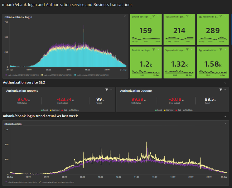
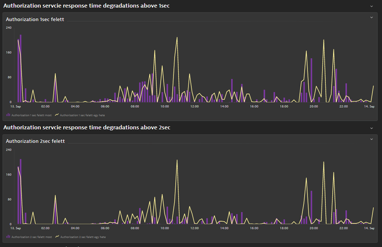
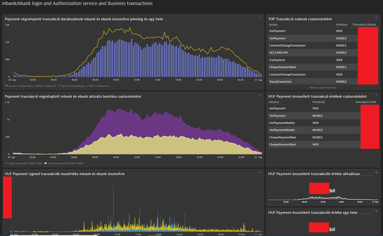
But I am proud for my next dashboard, where I combined the performance data with busniess data within one dashboard. I used the custom db query results (login, paymant transaction count, payment trasaction amount), SLO metrics and of cource service response time metrics. After an incident (eg, service outage) estimation can be done about the losses based on the trend data. One of my favourite feature is also applied on this dashboard: TimeShift. I love it.
Login data (by authentication channels via db query), Autorization service SLO and login trend (timeshift (-1w):
Response time degradation with timeshift also:
Business data with db query (transaction count and amount) with timeshift:
Br, Mizső
- Mark as New
- Bookmark
- Follow
- Mute
- Subscribe to RSS Feed
- Permalink
27 Sep 2022 05:01 PM
Great work Mizső
Last graphs reminds me of The Little Prince.
- Mark as New
- Bookmark
- Follow
- Mute
- Subscribe to RSS Feed
- Permalink
27 Sep 2022 05:33 PM
😂😂😂
- Mark as New
- Bookmark
- Follow
- Mute
- Subscribe to RSS Feed
- Permalink
06 Oct 2022 05:33 PM
@DanielS you made my day, love it! 😍 🐘
- Mark as New
- Bookmark
- Follow
- Mute
- Subscribe to RSS Feed
- Permalink
06 Oct 2022 05:35 PM
@Mizső , very well combined tech side with the business data, thanks for sharing! ![]()
- Mark as New
- Bookmark
- Follow
- Mute
- Subscribe to RSS Feed
- Permalink
13 Oct 2022 02:01 PM
Really cool!!!!! I really love how you have organized it!
- Mark as New
- Bookmark
- Follow
- Mute
- Subscribe to RSS Feed
- Permalink
26 Sep 2022 10:59 AM
Helloo All,
I have multiple Dashboards,
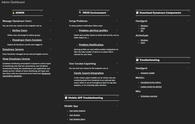
But in My case my favorite which is common to all customers is the Admin Dashboard.
We can see interesting links, links to other Dashboards...
We are still adding more things on it.
- Mark as New
- Bookmark
- Follow
- Mute
- Subscribe to RSS Feed
- Permalink
26 Sep 2022 11:57 AM
Very nicely divided categories! 👍
- Mark as New
- Bookmark
- Follow
- Mute
- Subscribe to RSS Feed
- Permalink
06 Oct 2022 05:30 PM
It looks like a "table of content" / documentation site.
Very helpful in everyday work @Malaik.
- Mark as New
- Bookmark
- Follow
- Mute
- Subscribe to RSS Feed
- Permalink
13 Oct 2022 02:00 PM
😂🤣 I guess we finally have to revisit our choice whether or not to touch markdown again.. seems like you use it .. a lot ^^
- Mark as New
- Bookmark
- Follow
- Mute
- Subscribe to RSS Feed
- Permalink
27 Sep 2022 04:28 PM
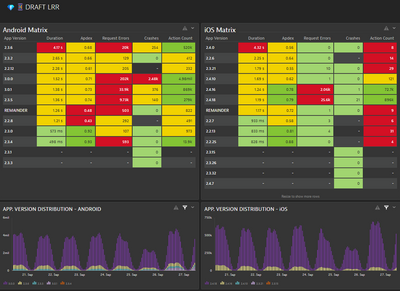
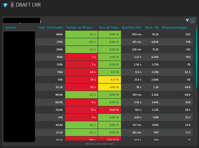
I'm working with a customer who wants to know every release of their mobile application and how fast the customers are adopting the new versions.
Also, they want to know if the new versions are better or not in terms of Requested Errores, Apdex, Duration, etc.
They are viewing every minute how their principal microservices are experiencing degradations or not, and take action before the end users where impacted.
- Mark as New
- Bookmark
- Follow
- Mute
- Subscribe to RSS Feed
- Permalink
27 Sep 2022 04:35 PM
Hi @cesarsaravia ,
Awesome... I would use it 😉 It is a very good and powerful usecase. Thank you fot sharing it.
Br, Mizső
- Mark as New
- Bookmark
- Follow
- Mute
- Subscribe to RSS Feed
- Permalink
27 Sep 2022 04:46 PM
Hi @Mizső,
I appreciate it. Is very helpful those metrics for the customers who have Mobile Apps.
César S.
- Mark as New
- Bookmark
- Follow
- Mute
- Subscribe to RSS Feed
- Permalink
27 Sep 2022 04:55 PM
Hi, @cesarsaravia ,
It is not a question. I think I am going to "stole" it and create a copy for my clinets about it where mobile app is instrumented.
Br, Mizső
- Mark as New
- Bookmark
- Follow
- Mute
- Subscribe to RSS Feed
- Permalink
27 Sep 2022 07:29 PM
- Mark as New
- Bookmark
- Follow
- Mute
- Subscribe to RSS Feed
- Permalink
27 Sep 2022 05:23 PM
Great Idea!!!! Love this one.
- Mark as New
- Bookmark
- Follow
- Mute
- Subscribe to RSS Feed
- Permalink
06 Oct 2022 05:27 PM
Awesome! 🔝
Thanks for sharing @cesarsaravia
- Mark as New
- Bookmark
- Follow
- Mute
- Subscribe to RSS Feed
- Permalink
13 Oct 2022 01:58 PM
Funky Tables! Glad our work last year brought value to you and seems to make sense ;)!
- Mark as New
- Bookmark
- Follow
- Mute
- Subscribe to RSS Feed
- Permalink
27 Sep 2022 06:03 PM
OMG! It's an amazing Dashboard.
- Mark as New
- Bookmark
- Follow
- Mute
- Subscribe to RSS Feed
- Permalink
28 Sep 2022 08:16 AM
So neat and clean! Such a delight to look at ![]()
- Mark as New
- Bookmark
- Follow
- Mute
- Subscribe to RSS Feed
- Permalink
06 Oct 2022 05:25 PM
So clean, and so... green! 💚
- Mark as New
- Bookmark
- Follow
- Mute
- Subscribe to RSS Feed
- Permalink
06 Oct 2022 09:18 PM
Just for the picture, then always red.
- Mark as New
- Bookmark
- Follow
- Mute
- Subscribe to RSS Feed
- Permalink
07 Oct 2022 08:34 AM
😉
- Mark as New
- Bookmark
- Follow
- Mute
- Subscribe to RSS Feed
- Permalink
13 Oct 2022 01:55 PM
I think I know why... just because 99 percent is green there :P? Anyways, green is awesome!
- Mark as New
- Bookmark
- Follow
- Mute
- Subscribe to RSS Feed
- Permalink
13 Oct 2022 01:56 PM
ohh and my fav viz on there is the wave!
- Mark as New
- Bookmark
- Follow
- Mute
- Subscribe to RSS Feed
- Permalink
29 Sep 2022 08:29 PM - edited 29 Sep 2022 08:30 PM
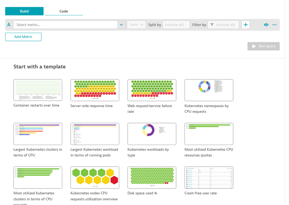
Opened Data Explorer today and saw "templates" for the first time. Clicked on one and immediately found an issue!!! This is so great!
- Mark as New
- Bookmark
- Follow
- Mute
- Subscribe to RSS Feed
- Permalink
13 Oct 2022 01:54 PM
i hope the issues was not with the template itself 😅!
- Mark as New
- Bookmark
- Follow
- Mute
- Subscribe to RSS Feed
- Permalink
13 Oct 2022 02:53 PM
Hello,
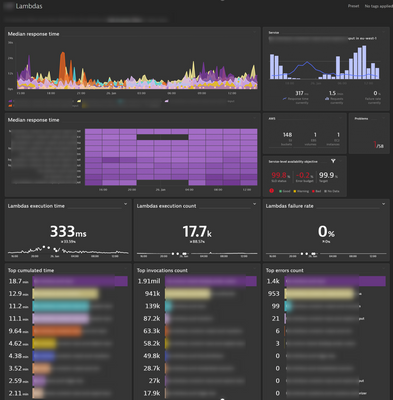
It may not be the most sexy dashboard but a day-to-day faithful companion to manage lambda performance for my client's devops team :
- Mark as New
- Bookmark
- Follow
- Mute
- Subscribe to RSS Feed
- Permalink
13 Oct 2022 03:00 PM
c'mon! Its orderly, its colorful. I really like the "flamy" kinda graphs on top and it even has a heatmap! So I can't think of whats missing or wrong for it not to be sexy 😛
- Mark as New
- Bookmark
- Follow
- Mute
- Subscribe to RSS Feed
- Permalink
17 Oct 2022 10:10 AM
Awesome! 💜 Thanks for sharing, @AurelienGravier !
- Mark as New
- Bookmark
- Follow
- Mute
- Subscribe to RSS Feed
- Permalink
17 Oct 2022 01:48 PM
Great work @AurelienGravier !!! That heatmap reminds me of:
- Mark as New
- Bookmark
- Follow
- Mute
- Subscribe to RSS Feed
- Permalink
26 Oct 2022 11:12 AM
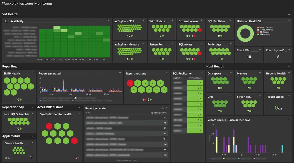
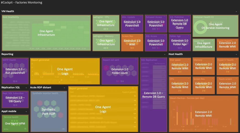
Here is my contribution!
Use case : Build a monitoring for Helpdesk Team to check MES (Manufacturing Execution System) configuration compliance. One MES host per factory. I had to build some extensions to track different datasources and custom needs.
- Mark as New
- Bookmark
- Follow
- Mute
- Subscribe to RSS Feed
- Permalink
26 Oct 2022 11:25 AM
Hi @jegron,
Amazing!!! Well done!!! I really like it!!!
Best regards,
Mizső
- Mark as New
- Bookmark
- Follow
- Mute
- Subscribe to RSS Feed
- Permalink
26 Oct 2022 04:53 PM
Really Nice, congrats.
Featured Posts
