- Dynatrace Community
- Community
- Community news
- Community updates - August 20, 2021
- Subscribe to RSS Feed
- Mark as New
- Mark as Read
- Bookmark
- Follow
- Printer Friendly Page
Hello Dynatrace Community,
We've published a bunch of UI/UX updates to the Community. Here are some of them:
1. Changes in the padding of various elements in the forum and smaller buttons
We've decreased a little bit the amount of white space in the forum pages (and made buttons smaller as well), so you can see more forum content right from the start.
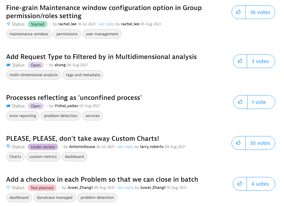
2. Product ideas statuses now have their own colors
Now you will be able to see more clearly which Product Ideas got which status.
3. Status changes without a comment take less space
Status changes that didn't have any comments in them used to take a lot of space, which made scrolling through comments for ideas a little bit troublesome (especially if there were a lot of status changes). Now they take much less screen space, but still provide the most important information: who and when changed the status and to which one. The status change message is now also a little bit bigger and bolded.
4. Dropdown menus clean-up
The dropdown menus (especially for Moderators), had a lot options that either were exposed in the UI in other places or just weren't that useful overall. To make the whole experience a little bit more streamlined, we've cleaned it up a little bit.
5. New set of emotes from the Community Challenge!
We've added a lot of new custom emotes chosen by you and in the next update, we'll add even more! Also, we've increased the size of emotes a little bit.
6. New subforum look
You can check out this article to learn more about the new subforum experience 🙂
We are still working on these known issues:
- Load more button on the Community home page loads the same posts.
- Email notifications on label subscriptions are not sent.
As always, we appreciate your feedback - if you have any suggestions about what changes (especially for UI/UX) we should make in the Community, let us know in the comments!


